Discussions surrounding the brightness levels of HDR often talk about brightness as if there were some fixed, immutable number beyond which the picture becomes unwatchable (for many, that number is 48 nits!), whereas studies conducted by Dolby and DCI both showed conclusively that viewers overwhelmingly prefer brighter picture levels than are currently available in home theater or digital cinema.
Entirely missing from the conversation is the perceptual nature of brightness, which is affected by factors such as:
- Color intensity.
- The length of time taken to transition from very dark to very bright images (just one reason why editors should also be availing themselves of an HDR monitor).
- Location of the brightest pixels. Pixels closer to the center are perceived as brighter than those at the periphery of the visual field.
- The proportion and size of the brightest areas.
- The surrounding brightness of the brightest pixels.
- The peak luminance of the display itself. Viewers quickly adapt to the peak luminance of the display and studies have shown that an APL as high as 25% of peak luminance is comfortable to watch. This is also why ‘reference white’ levels rise as the peak luminance of the content increases.
- Duration – the length of time bright areas are on screen.
- Context. Viewers are not surprised that a flashlight or the beam of a projector in a dark room are momentarily intense, but a persistently bright sky in drone footage can be seriously uncomfortable to watch, even though in reality, the sky is much brighter than a projector bulb.
- Viewing conditions – primarily visual angle, distance from the display and ambient light – all impact perceived brightness.
- At least one study suggests that as users become familiar with HDR technology, the luminance preference may increase.
Because of these and other factors, MaxFALL and APL are unable to fully characterize the impact wide color gamut (WCG) and the extended luminance of HDR have on perceived brightness. Color brightness contribution is almost inversely proportional to its contribution to the luminosity function, yet current techniques do not take into account the saturated colors of WCG.
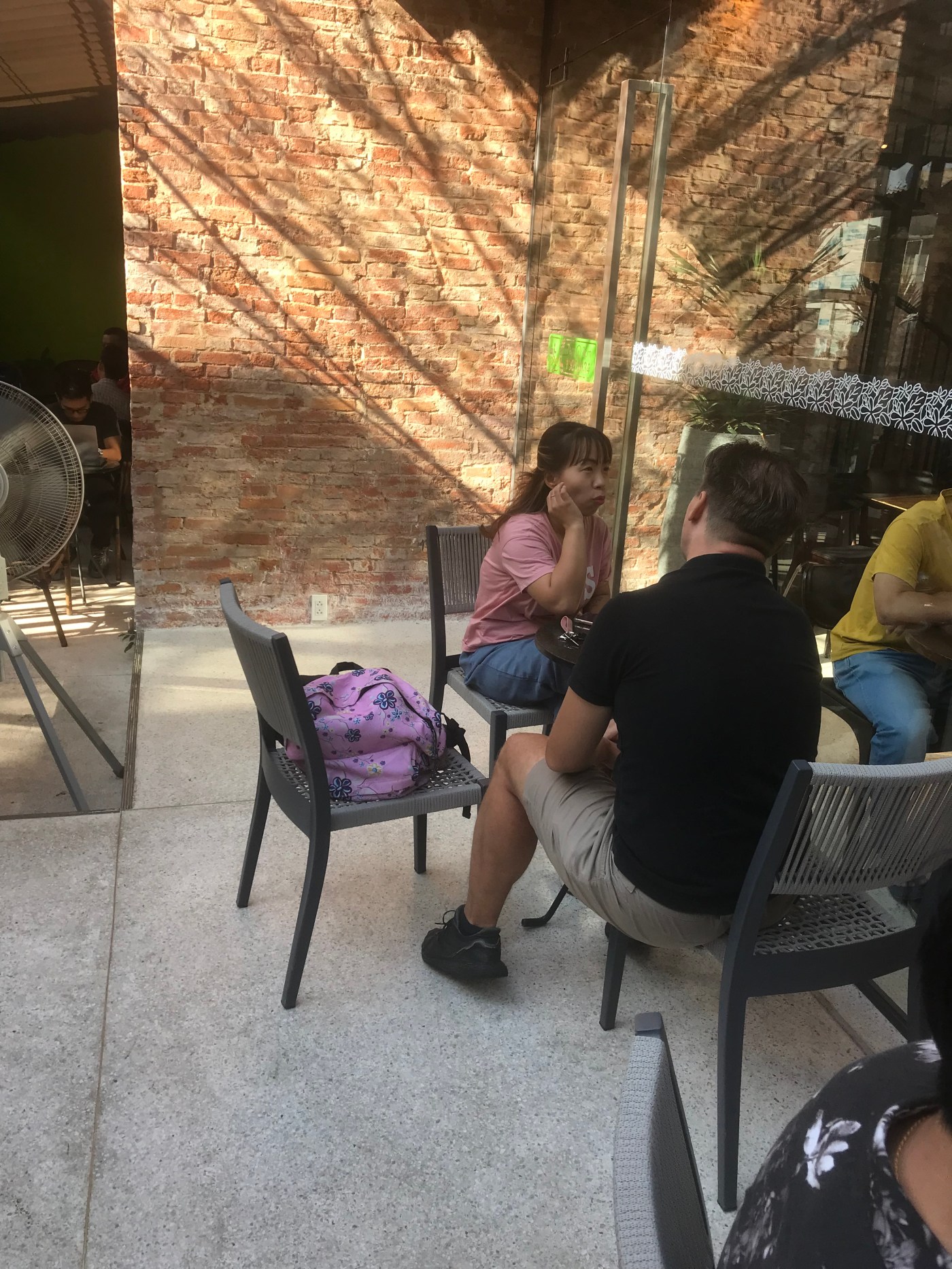
According to Cullen Kelly, if you were talking to someone in front of a bright window, you’d ask them to move because it would be uncomfortable, which is why windows in movies should always sit near middle gray or at least closer to the subject brightness level. At the coffee shop this morning, your intrepid narrator watched as a couple were having what appeared to be a very pleasant conversation, yet the woman, whose face was buried in shadow, was sitting directly in front of a very bright brick wall in direct sunlight and incredibly, the man did not seem to be experiencing any physical distress at all. Quite the contrary, in fact. When I approached the couple and asked the man why he didn’t have his companion move away from the wall so he didn’t damage his eyes, he just laughed and said that he sees me at the coffee shop all the time with my RED camera. :))
Note: Naturally, low dynamic range cannot possibly convey just how intensely bright the brick wall behind the woman in the photo was!

Maybe HDR stills could convey the intensity of the wall more accurately? https://alexfry.github.io/ACES_ODT_Candidates_Examples/sdrVsHdr.html