")
Part I: Project settings, Project Render Settings, Generate MaxCLL and MaxFall HDR10 Metadata
Part II: RAW
Part III: The Grade

Setting A Speed Limit
“If you come to me tomorrow and you say ‘Hey, I’ve got an HDR project I’d love to grade with you,’ I’ll say ‘Okay cool’, and very early on in the process I’m going to say ‘Let’s set our speed limit in terms of luminance.’ And if you ask me for my take and you want to go with my suggestion, I’m going to suggest that we set a speed limit of around 250 nits because I don’t want to see an image brighter than that.” – Cullen Kelly, colorist
Setting The Speed Limit Is Job #1
When asked if he had any tips for those undertaking Dolby Vision HDR grading for the very first time, Siggy Ferstl, senior colorist at Company 3, gave the following advice:
“Understand the look [that] the filmmakers are wanting and establish early on the sort of bright[ness] levels, how far you want to push the highlights… That’s probably […] the number one thing to establish before you even start doing the creative color… That will change the look of the show and also, if you say for instance go too bright in establishing that light and then you get into coloring, it can put a lot of extra work on you if you’re having to sort of force the highlights down the whole time.” – Siggy Ferstl, “Working in HDR – From Set to Screen: Lost in Space”, Dolby YouTube channel (June 4, 2020)
What It Means To Set A Speed Limit
Setting a speed limit means defining your target peak brightness (in nits) and highlight roll-off philosophy early on. Before diving into creative color, the most critical decision an HDR colorist makes (in collaboration with the DP/director) is establishing the project’s target peak brightness (nit level) and highlight philosophy. It is arguably the single most important foundational decision for HDR grading.
Cullen Kelly: Do you impose a hard speed limit on your projects?
Corinne Bogdanowicz: I don’t have a hard rule or setting that I use. [It] depends on the project. I rarely peak things at 1,000 nits. Most people don’t react well to things being that bright. I generally start with a roll off but I could still go up to 600 nits. If it’s a much softer show, we’ll maybe do 300 nits – maybe even less. But again, it might change scene to scene. There might be some brighter scenes, there might be some scenes that are softer, so it just kind of depends on what we’re doing. — “An interview w/ Corinne Bogdanowicz”, Cullen Kelly YouTube channel (June 20, 2024)
Why Setting A Speed Limit Early On Is Crucial
HDR’s expanded dynamic range isn’t about making everything dazzlingly bright. Establishing peak highlight levels early on ensures that brightness serves the story, not the technology. Defining how far you want to push the highlights encourages a conversation about the look and mood before the technical work begins.
Prevents Headaches Later On
As Ferstl explicitly states, setting this limit early prevents a massive workflow headache. If you start grading without a clear peak target, highlights naturally tend to creep higher during creative exploration. Realizing later that these highlights are too aggressive means you must painstakingly lower them across potentially hundreds of shots, which is far more time-consuming than establishing a limit upfront.
Provides For A Unified Grade Across The Project
HDR projects not infrequently involve thousands of shots graded by potentially multiple artists over weeks or months. A clearly defined peak brightness target is the anchor point for consistency.
Defining A Peak Informs Roll-Off
Defining the peak isn’t just about a hard ceiling; it informs the roll-off – how highlights transition to that peak. Establishing this early ensures you preserve texture and detail in bright areas gracefully, rather than accidentally clipping or creating harsh transitions that need fixing later.
In sum, setting a speed limit should be the cornerstone of any HDR workflow discussion.
“Some of the worst practices I’ve seen in this industry have been people dumbing down the HDR [grade] because a DP comes in the room and says they don’t like highlights, so they put their highlights at 200 nits. And then now they’ve basically graded SDR on an HDR display. And I don’t care if you’re doing HDR10 dual pass, if you start with a master that’s got such low contrast, the CMU is going to see that and be like ‘What do you want to do here?’ and it’s going to give you a pretty flat, muddy picture.” – Tony D’Amore, Senior Colorist and Director of Creative Workflow, Picture Shop, “Conversations with Colorists: Picture Shop | Dolby Institute’, Dolby YouTube channel (October 31, 2023)
Studios Do Not Dictate Peak Brightness
In 2019, the major Hollywood studios issued a joint statement asserting that the brightness or darkness of each shot of a film is up to the filmmaker:
“It is also worth highlighting that a critical feature of the HDR system developed by DCI is one of creative expression. An HDR DCP need not exercise the entire range of brightness offered by the HDR specification. Despite the peak luminance that an HDR system is capable of, the brightness or darkness of each shot of a movie is always up to the filmmaker. It is not up to the HDR projector or display, which simply provides the full range of capabilities. DCI seeks to ensure that the headroom required to reproduce a filmmaker’s creative vision exists, whether that be the darkness of a cave, a candle, a car’s headlights, a meteor, or sunlight spilling through a window.” – Venue, “DCI (Digital Cinema Initiatives) D-Cinema HDR”, AVSForum (Jan. 24, 2023)
DCI is a consortium of major motion picture studios formed in 2002 by Metro-Goldwyn-Mayer, Paramount Pictures, Sony Pictures Entertainment, 20th Century Fox, Universal Studios, The Walt Disney Company and Warner Bros.
A number of colorists have confirmed that studios rarely raise objections pertaining to peak brightness.
“You can make images on an HDR screen identical to the range you had in SDR, if you want. No one should, or will, as far as I’ve heard, force you to make the image higher in contrast than you are comfortable with. If your vision is to limit and roll off all highlights (to where they would be in the old SDR TV or even film print) you can. It’s your creative choice. A streamer may query it, but it’s unlikely they will force you to grade to a maximum brightness (or nit value as it’s known). – Thomas Urbye, colorist (Sex Education, 2019-2023), “A brief guide to HDR, ACES and Dolby Vision for DOPs, Directors and more”, The Look Blog (Nov. 25, 2022)
Key Distinctions Between SDR & HDR Highlights
In traditional photography, the term ‘highlights’ is sometimes used to refer to any detail near white, such as bridal lace, which may entirely consist of diffuse reflective surfaces, [while] in HDR literature, the use of ‘highlights’ is intended for the specular or emissive regions in an image since that is a key feature opened up by HDR. – ITU-R BT.2390
“The cinematographer’s job to do good HDR is don’t clip the signal.” – Juan Cabrera, Senior Colorist & Founder, LightBenders, “SMPTE Hollywood Presents: SDR and HDR – There’s More to Discuss”, SMPTE Hollywood YouTube channel (Feb. 13, 2024)
SDR signals provide little “headroom” for highlights. Whereas clipping of highlights is quite common in SDR content, it is uncommon in well-graded HDR content, which is one of the fundamental differences between SDR and HDR imagery. See: Michael D. Smith and Michael Zink, “On the Calculation and Usage of HDR Static Content Metadata”, SMPTE Motion Imaging Journal (Aug. 2021). IEEE Xplore
Rolling Off Highlights Prematurely
“And now, if we think further about negative emulation, all kinds of other interesting questions come into play that kind of go along the lines of what we were just talking about, like what are the great things and also the limitations of a film negative. Here’s one that is not popular and people don’t like to talk about: film negative doesn’t have the dynamic range that a modern digital sensor does. It just doesn’t. So, what do we do with that? Do I want to mimic the lower dynamic range of a film negative? That’s not the craziest thing in the world but it’s also another example of the type of subjective question we have to answer if we’re going to emulate film negatives – like, what parts do we want to emulate? Do we really want to emulate that part? I don’t necessarily see a benefit to rolling off my highlights prematurely that otherwise would be preserved and available to me in a grade. I’m not sure what the benefit is there.” – Cullen Kelly, “Grade School: Film & Film Emulation from a Senior Colorist” Cullen Kelly YouTube channel (Dec. 25, 2021)
Highlight Roll-Off Is Non-Negotiable
Highlight roll-off is a characteristic of photochemical film that many believe is as important as dynamic range. HDR has no highlight roll-off whatsoever. If we want to emulate the film look, rolling off highlights is a necessary evil. How highlights roll off is a critical creative decision, significantly impacting color and texture and consequently the feel of materials (metal, water, skin), light sources, and atmosphere.
Highlight Roll-Off: Best Practices
Deciding how much highlight roll off to apply is a balancing act between preserving artistic intent and maintaining detail and texture. Choosing the amount of highlight roll-off that works best for the project, then tailoring it to each scene using tools like contrast/pivot, custom curves and power windows is a good strategy.
“The important thing with film and HDR is maintaining the highlight roll-off and making it feel filmic, because one thing that HDR does enhance, is it can make your grain a lot more apparent in a way that’s not very attractive, especially as you push in the highlights, because you just have so much more highlight range now that in your scans, you’re just kind of stretching the contrast of the top end of your image. So, being mindful of your highlight roll-off is the most important thing. I mean, that’s just general with HDR and making it feel appealing, but with film especially, because your grain can start looking noisy and a little gross.” – Matt Wallach, Senior Colorist, Company 3. “A Nerdy Conversation With Matt Wallach From Company 3”, Working With Film Scans For HDR Deliverables, DeMystify Colorgrading YouTube channel (May 17, 2025)
The perils of applying excessive highlight roll-off:
- Erodes contours, destroying the volume of shapes and surfaces
- Tosses out texture and detail
- The image becomes flat
- Lessens the impact of specular highlights that are requisite for HDR
- Impacts colors, making them less saturated.
- Image resembles SDR
The advantages of applying an appropriate amount of highlight roll-off:
- Flattering to faces, more forgiving of imperfections
- Decreases perceived sharpness that persons of discernment find objectionable
- Fewer hotspots, minimizing the number of power windows required
- Suppresses noise
- Lower contrast reduces the intrusion of judder that is aggravated by today’s high contrast, high luminance displays
- It’s a key component to achieving the analogue film look
Budgeting For Highlights
While in SDR, “highlights” might be ~ 2.7X diffuse white, in HDR, highlights can be as high as 10X diffuse white:
“In traditional imaging, the range allocated to these highlights [specular highlights and emissives] was fairly low and the majority of the image range was allocated to the diffuse reflective regions of objects. For example, in hardcopy print the highlights would be 1.1x higher luminance than the diffuse white maximum. In traditional video, the highlights were generally set to be no higher than 1.25x the diffuse white. Of the various display applications, cinema allocated the highest range to the highlights, up to 2.7x the diffuse white.” – ITU-R BT.2390
Diffuse White, Headroom & Separation
Leaving little headroom (i.e. a higher value) means brighter diffuse whites at the expense of flatter looking specular highlights, while leaving more headroom allows for better looking highlights.
“A High Dynamic Range System (HDR System) is specified and designed for capturing, processing, and reproducing a scene, conveying the full range of perceptible shadow and highlight detail, with sufficient precision and acceptable artifacts, including sufficient separation of diffuse white and specular highlights.” [italics added] SMPTE Study Group Report High-Dynamic-Range (HDR) Imaging Ecosystem (2015)
Diffuse White Level Not Fixed

The majority of HDR narrative work has a diffuse white level much lower than that recommended by the ITU and it’s a constantly shifting target. This may frustrate those desperate for hard and fast rules, but this approach has a number of advantages, not least of which is that it accords the colorist considerable artistic freedom to set aside that additional reserve for individual scenes to powerful dramatic effect.
Neil Robinson, formerly Senior Director, Strategic Projects at LG Electronics (currently at Apple), confirmed that most theatrical and episodic content takes a much more conservative approach toward diffuse white than that established by the ITU, writing that despite “ITU recommendations, most theatrical and episodic HDR content does not have a diffuse white level of 203 nits. The diffuse white level in such content usually changes from scene to scene, and is far closer to the typical diffuse white level of SDR content of between 80 and 100 nits at most.” See: LG Electronics – UltraFine OLED Pro Monitor Best Practices and Additional Usage Information, V1.05-J (June 25, 2021)
Saturation

You might want to create a new node at the beginning of your node tree and knock down saturation of highlights and shadows a smidgen. Authorities insist shadows must be neutralized, but you should decide for yourself what works best.
As a rule of thumb, the more contrasty the image, the less saturation you’ll need in the image overall. Another general principle is that highly saturated colors should not be too bright.


While the extended color volume of HDR results in perceptibly more vibrant colors, it pays to be cautious with saturation. Glowing skin and radioactive foliage are indications that saturation is cranked up too high. To keep an eye on saturation, use the vectorscope. In order to see the highlight and shadow excursions, enable the “extents” option of your scopes. Extents create an outline highlighting all graph excursions to show you the true level of all overshoots and undershoots in the video signal.

If you’ve got good color separation, the signal mass in the vectorscope should be straddling at least two quadrants while preserving skin tones. Instead of using the saturation knob to increase saturation, how about trying out this method instead:


HDR Palette
The customizable zones of the HDR Palette and in DaVinci Resolve allow the targeting of specific tonal ranges in the image. You’ve still got to watch the waveform monitor when making adjustments though, since even when it looks like an area has been isolated in the viewer, the actual coverage might be greater, making it necessary to use a power window.


Custom curves
The overwhelming majority of online tutorials recommend making an S-curve, but they fail to make the crucial distinction between footage that has been underexposed, exposed for middle gray, or overexposed. Properly exposed S-Log3 should be exposed to the right by around +1.66 stops – and the correct way to shape the curve is to grab it somewhere around the mid-point and gently drag it downward.
Furthermore, an S-curve is not ideal as a primary, one-size-fits-all approach for HDR footage. While S-curves are standard for SDR to add contrast and to mimic the tonality of print film, HDR grading requires managing high-nit values and rolloff, which S-curves do not handle properly. An S-curve is designed to create “punchy” contrast, effectively crushing the shadows and clipping the highlights that HDR was designed to preserve.

On the other hand, if the footage has been underexposed, you’ll be grabbing the curve toward the left side and gradually lifting upward to form a curve in the opposite direction of the overexposed clip above.

Create color separation with split-toning
Split-toning is a characteristic of film stocks where you’ll see cool shadows and warm highlights adding color contrast to the image. This is accomplished by un-ganging the channels and adding a few pixels of blue and green to the shadows, a tiny bit of red and green to the highlights. Once you’ve made your adjustments to the curve, you can finesse them with the sliders to the right. Just remember, 50 represents zero – for example, moving the red slider to the left of 50 begins to add cyan.

It may seem trivial, but split-toning is the single most important ingredient toward creating a look; and the image will be perceived as more colorful and less video-ish than dialing in more saturation. The look can be further refined by nudging yellow a bit toward orange, green toward teal-green and red toward orange in Hue vs. Hue; adjusting the saturation of each color in the Hue vs. Sat curves; and reducing saturation in the upper midtones and highlights in the Sat vs. Sat curves.
Middle Gray
While preserving middle gray is vital during the initial look development phase to anchor the overall contrast and perceptual relationships within the grade, the expanded dynamic range of HDR offers greater flexibility than SDR. Once the foundational look has been established, middle gray can be adjusted scene-by- scene as needed for creative intent or exposure correction, leveraging HDR’s headroom without fundamentally breaking the established contrast structure. Cullen Kelly’s free chart includes 14 different tone curves, including ACES, Arri, Slog3, Log3G10 and DaVinci Intermediate.

To use the chart, follow the steps below:


Noise Reduction
When mastering in PQ (ST 2084), much of the signal range is devoted to shadow detail. Noise in darker image regions is visually masked by highlights in the image. You can witness this for yourself by covering the highlights with one hand while looking at the shadow areas of your video displayed on the monitor. Tone mappers, which compress the tonal range of HDR video to the capabilities of the end-user display, also strongly emphasize image noise, particularly in the shadows. YouTube’s processing already removes some noise to achieve streaming bitrates. In order to exercise more control over the final image, you may want to denoise your video prior to rendering it for upload. Many YouTube tutorials improperly recommend enlarging the image 999%, indiscriminately blasting luma and chroma noise with heavy amounts of noise reduction, followed by tossing in hideous amounts of sharpening, destroying true detail and making the picture look like cheap camcorder footage. We suggest instead using noise reduction sparingly and adding as little sharpening as possible while being on the lookout for undesirable artifacts.

To check noise reduction in DaVinci Resolve Studio, use the highlighter in A/B mode. It may take a few moments to kick in, depending on your machine. If you start to see outlines of the subject, actual detail in the image is being affected and noise reduction should be reduced. Additionally, we suggest examining the pores of the talent’s skin for excessive smoothing, banding in large areas of uniform color with fine gradients, like walls and skies, as well as being on the lookout for jaggies or sawtooth effect, an objectionable artifact that makes the smooth outlines of objects resemble a series of staircases. In general, you’ll want to preserve some noise to prevent banding.

Spatial – Mode Faster – Radius small – Luma 2 – Chroma 2

Rather than applying noise reduction to the entire clip, you might consider just hitting the darker regions of the image where noise is most bothersome:


Film Grain
“Film grain can be an important visual element for Hollywood directors as it can contribute to the overall look and feel of a film. It can add a sense of texture, depth, and authenticity to the image, and can also help to create a certain mood or atmosphere. In addition to its aesthetic qualities, film grain can also be used strategically by directors to control the brightness and contrast of an image. By adjusting the amount of grain present in the image, a director can subtly alter the look and feel of the scene, enhancing certain elements or drawing attention to specific areas of the frame.” – A SUBJECTIVE STUDY OF FILM GRAIN SYNTHESIS FOR THE PRESERVATION OF CREATIVE INTENT. Jatin Sapra, Kai Zeng, Hojatollah Yeganeh
Grain adds texture to an otherwise squeaky clean, sterile digital image and, as HDR is rather unforgiving, is all but indispensible for hiding imperfections in complexions, makeup, graphics, visual effects and prosthetics. Adding a moderate amount of grain can help hide banding when uploading to video sharing platforms. Another seldom discussed aspect of grain is that it’s in constant motion, breathing life into each and every frame. At the same time, the aggressive compression algorithms of video sharing platforms like YouTube destroy high frequency detail, turning the voluptuous grain seen in the grading suite into unsightly macroblocking, so you’ll have to decide for yourself whether it might be preferable to not add grain to projects at all. If you are using a LUT, like Cullen Kelly’s Kodak 2383 PFE LUT for example, be sure to add your grain before, not after, the LUT.

Download a comparison between Dehancer 5.3 film grain and DaVinci Resolve grain here. It’s well-nigh impossible to see how the plug-in compares to Resolve on something like the MacBook Pro Liquid Retina XDR mini-LED, which is why we recommend throwing the clip on the timeline of your favorite NLE, setting it up for HDR and viewing on an external UHD monitor or television set.
Textural depth


During an appearance on Cullen Kelly’s Grade School, the brilliant colorist Jill Bogdanowicz revealed a secret to accentuating texture without it looking over-processed. While working on Joker, the colorist used Live Grain – which separates out the red, green and blue channels, creating grain that resembles scanned film – to accentuate texture in the cooler, darker backgrounds while de-emphasizing grain in the warmer, red tones of the talent’s skin.


One way to accomplish this in DaVinci Resolve is to create a node with film grain from Resolve FX or Dehancer, open up the HSL Qualifier and, using the highlighter tool to see the effect in the viewer, select the skin tones using the eyedropper tool. Afterward, apply clean white, clean black and blur radius to tidy things up. Next, copy and paste the node onto a second node, invert the HSL qualifier and add grain to the background. In this way, you can add finer grain to the subject’s face and coarser grain to the background to add depth to the picture.


The Scopes
Concerning an often asked question regarding the appearance of scopes in HDR10, one significant difference is that in SDR, the signal can ordinarily fill out the scopes, say, from 0-1023, while in HDR PQ, the bulk of the signal will usually be bunched up toward the bottom end of the waveform, from 0-200 nits or so, with only small excursions for specular highlights. So what ends up happening is that even if we set, say, 1000 nits as our peak brightness, we might actually only see occasional peaks at 400 or 600 nits and nothing greater than that, depending of course on the project and the subject matter.


The reason for this is that the average picture level (APL) of SDR and HDR should be similar (in fact, HDR not infrequently actually ends up being lower), and generally speaking, everything above ~ 500 nits is for specular highlights. So while our signal may very well appear identical when switching between 10-bit, 12-bit and HDR PQ in the waveform settings on the Color Page, if instead we were to switch the project settings themselves from HDR to SDR on the Color Management Page, we’d notice that our waveforms look quite different indeed – stretching out to fill the 10-bit scope while shrinking back down to below 100-200 nits in the HDR PQ one.
The Show Reference Levels checkbox lets you enable adjustable Low and High reference level markers by setting the Low and High sliders to something other than their defaults. These reference markers are especially useful for HDR grading where you’re working within a specific peak luminance threshold, such as when targeting 203 nits for diffuse white.

HDR Reference White
“One key new feature of HDR is that it can allow for scene to scene overall luminance changes, so that daylight scenes can feel substantially different from indoor scenes, and night scenes. Thus, constraining a system to set the diffuse white point to a constant luminance defeats some of the advantages of HDR.”
PUPILLOMETRY OF HDR VIDEO VIEWING

Daniele Siragusano of Filmlight explains the origin of the “reference white” myth:
“The 200 nits for graphics white are chosen for compatibility with SDR in simultaneous live broadcast of HLG. In simultaneous broadcast you have the issue that the same HLG signal is shown on an HLG and 2.4 gamma Rec.2020 monitor. If you acknowledge the fact that SDR 2020 monitors are typically set to 200-300 nits peak you need to make the diffuse white in the HLG signal brighter. Otherwise the signal would look darker on the HDR monitors compared to the SDR monitors. All of this is not applicable to motion picture and hence we did not follow ITU-R BT 2408.” – Daniele Siragusano, ACES Central, May 2025
This underscores the idea that many early HDR “standards” were about making HDR look acceptable to eyes accustomed to SDR, rather than exploring HDR’s true potential.
The “200 nits for white” isn’t a creative target; it’s a compromise for a specific, hybrid broadcast scenario. In film and television drama, the “correct” level for diffuse white is wherever the storyteller puts it.
In reality, there is no such thing as reference white, any more than there is a fixed value for 18% gray or fair skin. Diffuse white can be 145 nits indoors or as much as 400 nits outdoors, skin tones can be + 1.7 stops brighter outdoors than indoors, and the same goes for 18% gray! Leaving little headroom (i.e. a much higher value) means brighter diffuse whites at the expense of flatter looking specular highlights, whereas leaving more headroom allows for better looking highlights. If you’ve got graphics at 203 nits over a dark image, they may overpower the scene.

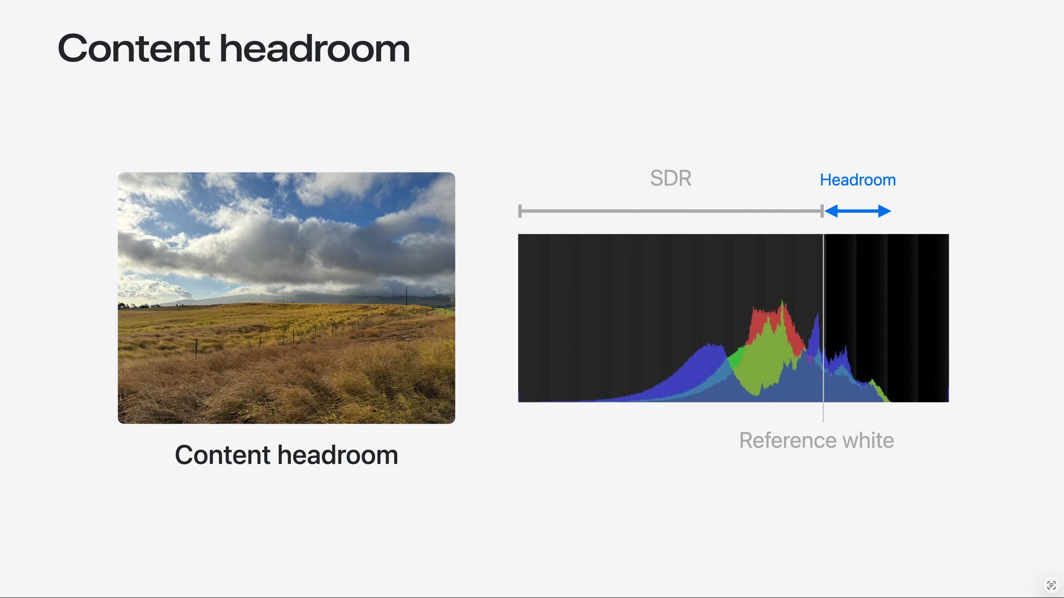
Definition of Headroom
“Per the ISO image standard, the brightest SDR signal is known also as reference white. Reference white is approximately the brightness of a page of a book in an indoor setting, or the white background of a Keynote presentation. An HDR display, on the other hand, lets us render specular highlights or light from emissive objects brighter than reference white. The extra brightness is known as headroom. In mathematical terms, headroom is the ratio between the HDR Peak and the Reference White. Headroom can also be represented as the logarithm of the value. When in Log form, we would say the the headroom is 1 stop, or 2 stops above reference white, to indicate that HDR is 2 or 4 times brighter. Now that we understand the notion of headroom, it is important to make a fundamental distinction, which will be useful later. When a file is encoded in such a way that the data contains brightness levels above reference white, we will call it Content Headroom. When we talk about the display’s ability to show brightness levels above reference white, we will refer to it as Display Headroom.” – WWDC24: Use HDR for dynamic image experiences in your app | Apple, Apple Developer Channel (June 13, 2024)

Excellent Info on the Nits Level for the Diffused White & 18% Grey patch of the Color Checker..
I was always confused about them..
Because when shooting in SDR .. I used to expose the image..until the Diffused White Patch on Color Checker started to show Zebra Marks ( Zebra set to 94 on my Sony A6300)..
But in HDR Grading I was always confused what the Nit Value for that same Diffused White Patch in Color Checker should be..
I was always confused where to keep my Diffused White Patch in the Waveform.. 100nit.. 200nit.. etc..
Your post exactly answers that question !
Thanks you so much !!!!
Also,
Purchasing a new camera soon..
What would you suggest – Sony A7IV or Sony A7S3…
The confusion for me is..I do both Photo and Video work.. and on paper the A7IV seems a good hybrid..
But its Crop in 4K60 mode.. very bad rolling shutter has now created some doubts in my mind..
A7S3 has really good Rolling Shutter performance.. but at 12MP.. it’s a bit on low end for Photos..
But 4K60 and 4K120 with no Crop makes it so much appealing…
With Sony cameras, you want to ETTR S-Log3 by as much as +1.66 stops, so setting zebras to 94, provided you’re able to recover those highlights in post, is in the ballpark. You’ll then park your diffuse whites in the neighborhood of 203 nits on the waveform in post, but as is explained in the blog post, that number is not carved in stone. I’m sorry, but I can’t give advice on a camera for stills, as I only do video.
Thank you so much Jon for your promt reply and the work your are doing in world of HDR !
HDR workflow, Hardware, Camera Equipment, Dynamic Range, Codecs, RAW, Grading Software, Monitors etc.etc. there are so many variables to it.
But I am extremely thankful that we have blogs such as yours that are demistifying this mountain of HDR..
With extremely detailed yet simple to understand information.
Really appreciate your work.
Again thanks. Keep up the good work Sir.
Last question – ( I know you have already mentioned in one of your blog post earlier – regarding sub 6000$ Camera for HDR and the minimum things they should have.. 13 Stops of DR, RAW or 10bit Log minimum )
As I had mentioned above.. I would love to buy A7S3 for HDR work.. but still surfing the market if there any Hybrid Camera out there..
Recently with the launch of Canon R5C it seemed a good proposition…
But not sure if it truly has 13Stops of Dynamic Range…
Did you get a chance to explore Canon R5C ?
Other option would be to go for Sony A1.. in CineD Labtest it demonstrates ~12.4 ~12.7 Stops of Dynamic Range..
And has good Photo capabilities as well..
But then going for A1 would be almost 1.6x more expensive then A7S3 or Canon R5C here in India..
Also Canon RF lenses in India are almost 2x more expensive compared to their Sigma or Sony E-mount counterparts…..
So thats a bummer..
Thanks for the kind words, Apoorv. As I wrote in one of my blog posts, several cameras under $6,000 with the required dynamic range include the Ursa 12K, the EOS C70 and the Red Komodo. I believe you’ve got to shoot 12K to get the best dynamic range out of the Ursa, however, and I don’t care for the form factor. Canon surprised everyone when they added RAW to the EOS C70 at up to 60p that records to ordinary V90 SD cards, so it is high on my list. The Komodo is a phenomenal camera but its true cost will be much higher than $6,000 after purchasing accessories and approved media. I think the body only sells for close to $8,000 here in Vietnam. The Sony a1 8K is 4:2:0 and as far as I know, it isn’t able to shoot 8K RAW, (I read somewhere that it shoots line skipped 4.3K ProRes Raw, but can’t confirm that) nor does it have a 4K HQ mode like the R5, so it is less interesting to me. I’ve been looking at reviews of the Canon EOS R5 C recently and it does appear to have decidedly more dynamic range and less noise than the R5, so it might very well be a contender – though the C70 still seems to be the better choice for those who plan to shoot strictly video. And yes, RF lenses are expensive!
Thanks Jon for the feedback.
I’ll explore Canon C70 ( maybe with a speedboster, one can also get closer to Full frame equivalent, Also built in ND is a plus ! )
I may download some sample footage and try to do some HDR this evening. 😊
Hi Man,
I read your articles but i’m not able to get the same result from the timeline and quicktime and youtube. https://workspace.picter.com/v/gcqR7ozn
I tried several set up, i followed the youtubes requirements upload, i did in h265 and prores 422, i’m editing with macbook pro m1 max with integrated hdr p3 1600 nits display and profile, davinci studio and file in Slog3Sgamut.cine from a7siii, very classic set up.
I experted with hdr10+ metadata, without, and 2084 rec 2020 and rec 2020 limited to p3, many time but the result on quicktime or youtube are alwais with low contrast, i do not understand why:( Can you help me to solve this problem? i can give you a big tip if you help me to solve this problem, thanks very much:)
ML, Davide Marconcini
Check your email.
I have an M1 Macbook Air. When I try to color grade in DaVinci Resolve on an HDR project(Rec.2020 ST2084 1000 nits), everything over about 500 nits is overexposed but when I export the footage, it looks fine. Is there any way to get around this problem?
The MacBook Air cannot be used for grading HDR.