Cullen Kelly’s rejection of HDR and belief that limitation is a virtue extend to his view of art history itself:
“Go find me a painting where you can discern more than five to six stops of dynamic range… that’s generally not the way we absorb a painting… that’s actually part of what makes those paintings so captivating.”
—Cullen Kelly, Colorist
The Old Masters didn’t sit around praising the “captivating” limitations of their pigments.
Neither did Alexis Van Hurkman, who wrote that his quest was:
“…to mine the fine arts that have come before us for creative solutions that already exist, but have been neglected due to colorists having been stuck within the narrow confines of BT.709 and BT.1886 for so long. Breaking free of those restraints makes the work of other artistic disciplines even more accessible to us as models for what is artistically possible.”
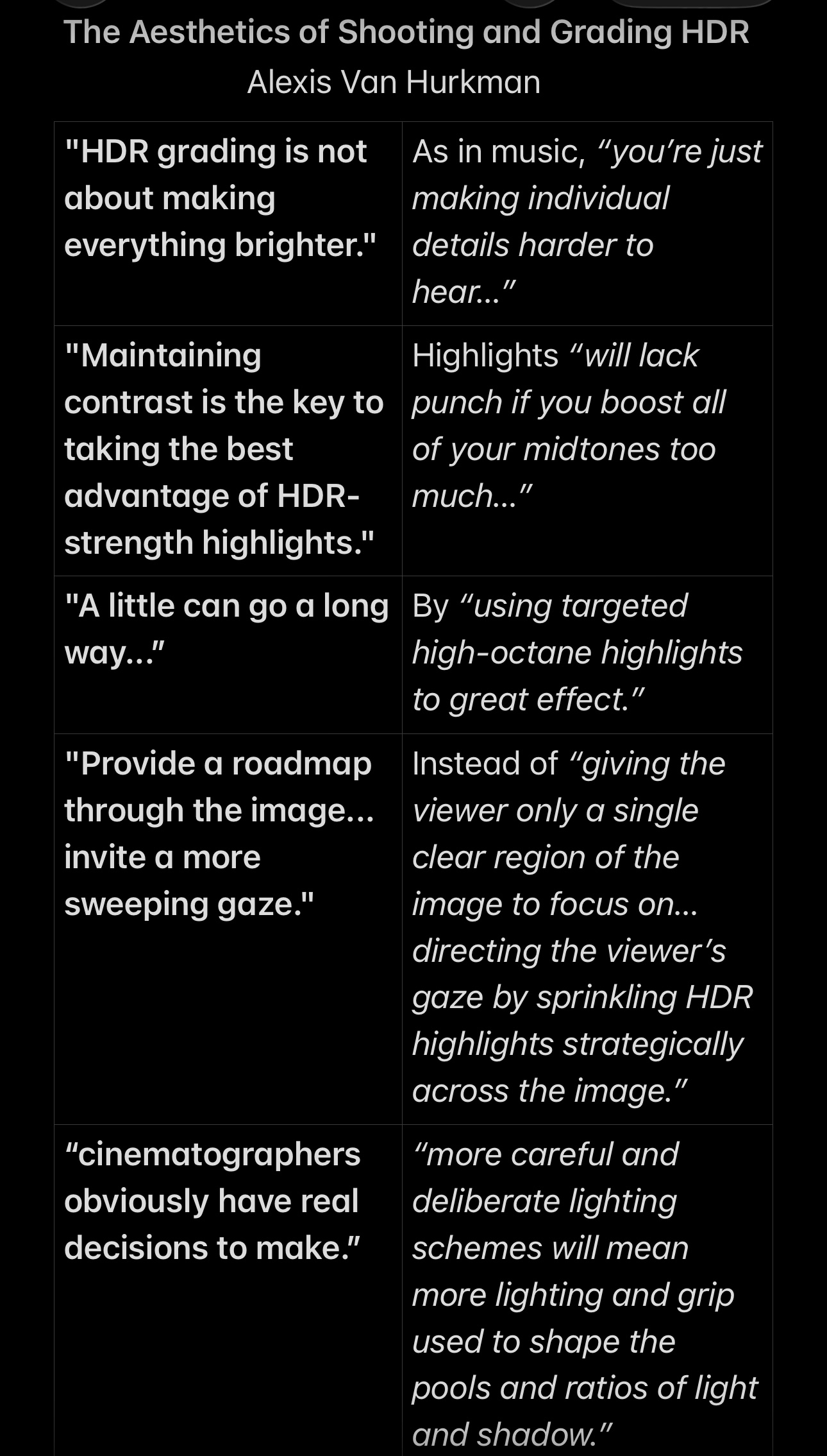
Five key lessons from Van Hurkman’s analysis:
1. “It cannot be over-emphasized that HDR grading is not about making everything brighter… just making everything brighter is like doing a music mix where you simply make everything louder. You’re not really taking advantage of the ability to emphasize specific musical details via increased dynamic range, you’re just making individual details harder to hear amongst all the increased energy bombarding the audience.”
2. “Maintaining contrast is the key to taking the best advantage of HDR-strength highlights, which will lack punch if you boost all of your midtones too much and neglect the importance and depth of your shadows. HDR images only really look like HDR images when you’re judicious with your highlights.”
3. Nicolas Poussin’s The Death of Germanicus is “a great example of using targeted high-octane highlights to great effect. Notice how the vast majority of the image is relatively dark… but the artist uses polished strokes of brightness in key areas to add specular highlights that make the image really pop. These highlights are few, small, and they’re carefully targeted…”
4. “…it’s a mistake to be too terrified of losing the audience’s attention to the bold highlights that are possible within an HDR image. […] instead of using grading as an invitation to the viewer to dwell on a single element of the picture, it might be time to compose, light, and grade in such a way as to invite a more sweeping gaze, guided in part by HDR-strength highlights.”
5. “Cinematographers obviously have real decisions to make. […] more careful and deliberate lighting schemes will mean more lighting and grip used to shape the pools and ratios of light and shadow. […] Additionally, the art department has an enormous contribution to make… Production Designers will be tasked with making sure there are highlights to be had through careful selection of set materials, paint, and glossy vs. flat regions of the environment. […] Wardrobe choices offer similar opportunities… Even the makeup artists can contribute. […] cosmetics with shimmer or gloss… become powerful tools to shape HDR effects on arguably the most important subject within any frame, people’s faces. All these are tremendously meaningful decisions when shooting for HDR mastering, and the prudent creative team would do well to schedule more on-camera testing with a colorist’s support to see how things are going to work out.”
Source: Alexis Van Hurkman, HDR, Resolve, and Creative Grading, alexisvanhurkman.com, May 6, 2016


Leave a Reply