
BT.1886 Color Space Conflation
The Standard: ITU-R BT.1886 defines only a reference Electro-Optical Transfer Function (EOTF). No white point. No color primaries.
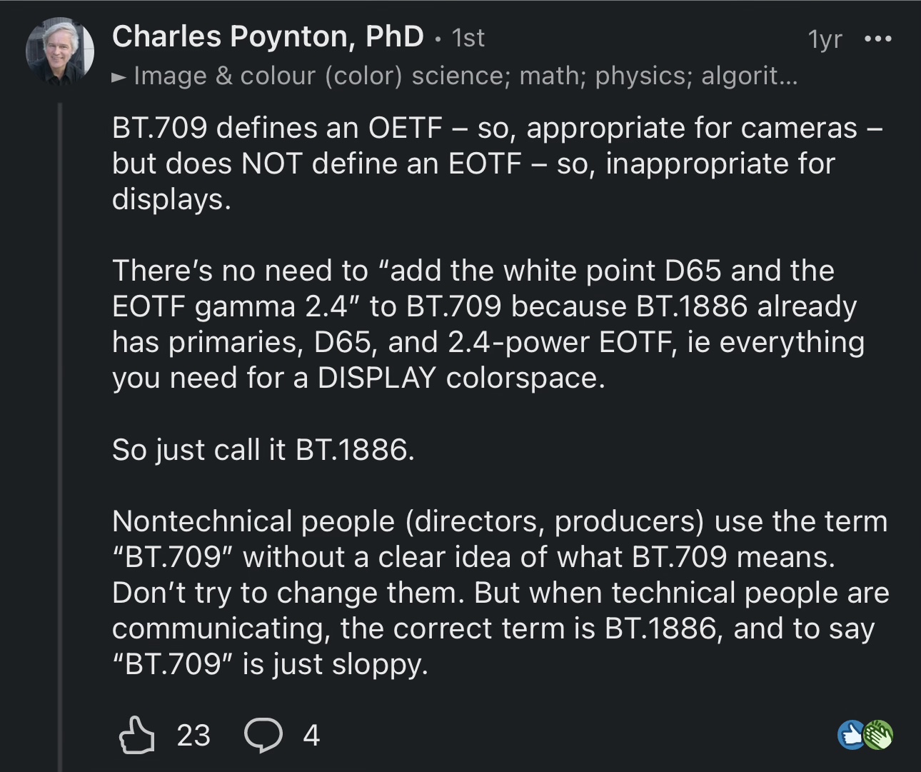
The Claim: Despite this, Charles Poynton states: “BT.1886 already has primaries, D65, and [an] EOTF,” making it a full “DISPLAY colorspace.”
The definition: As defined by ISO 22028-1, a color space requires three components:
- RGB Primaries
- A White Point
- A Transfer Function
The Verdict: BT.1886 provides only (#3). It contains zero specifications for (#1) primaries or (#2) a white point. These are exclusively defined by ITU-R BT.709.
Therefore, the claim that BT.1886 is a color space is false.
Industry Perspective
“The appendix in BT.1886 informatively repeats some info from BT.709 to clarify the transfer function in 709 is a reference OETF for capture and not a reference EOTF for display. The BT.1886 EOTF is also specified for BT.2020 capture and so does not specify a color space, only a reference EOTF. It can also be used with other primary chromaticities.” —Jack Holm, President & CTO, Tarkus Imaging
Former Principal Color Scientist at Hewlett-Packard; co-inventor of image-specific color rendering (US Pat. 6,249,315); key contributor to ICC color management and AMPAS ACES. | LinkedIn comment
Addendum
The Claim: “Rec. BT.1886… specifies the same primaries as BT.709.”
Source: Comparing Displays Using Luma Contours and Color Volumes, David A. LeHoty, Charles Poynton, Journal of the Society for Information Display, Vol. 36, Issue 5, pp. 16-21, Sept. 19, 2020
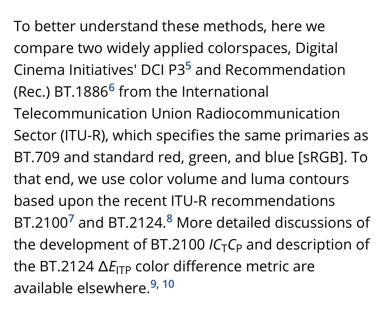
The Reality: This is a profound misrepresentation of both standards. ITU-R BT.1886 defines only an EOTF. It contains no normative specification for color primaries. The primaries for HDTV are exclusively and normatively defined by ITU-R BT.709. The verb “specifies” is a definitive term in standards language; its use here is incorrect and highly misleading.
The Claim: “HDR programming is mastered with wider color gamut, usually DCI P3, wider than the BT.1886 (‘BT.709’) gamut of SDR.”
Source: Luminance, brightness, and lightness metrics for HDR. 30th Color and Imaging Conference Final Program and Proceedings, Society for Imaging Science and Technology, 2022, pp. 24-29.
The Reality: This phrasing is a direct conflation. It incorrectly attributes the definition of a color gamut to BT.1886, a standard that solely defines an EOTF. The color primaries (the gamut) for SDR are exclusively defined by ITU-R BT.709. The parentheses misleadingly bundle BT.1886 as the primary entity possessing the gamut, reinforcing the false concept that BT.1886 is a container for colorimetric properties.
Refinement Under Pressure (Sept 2025)
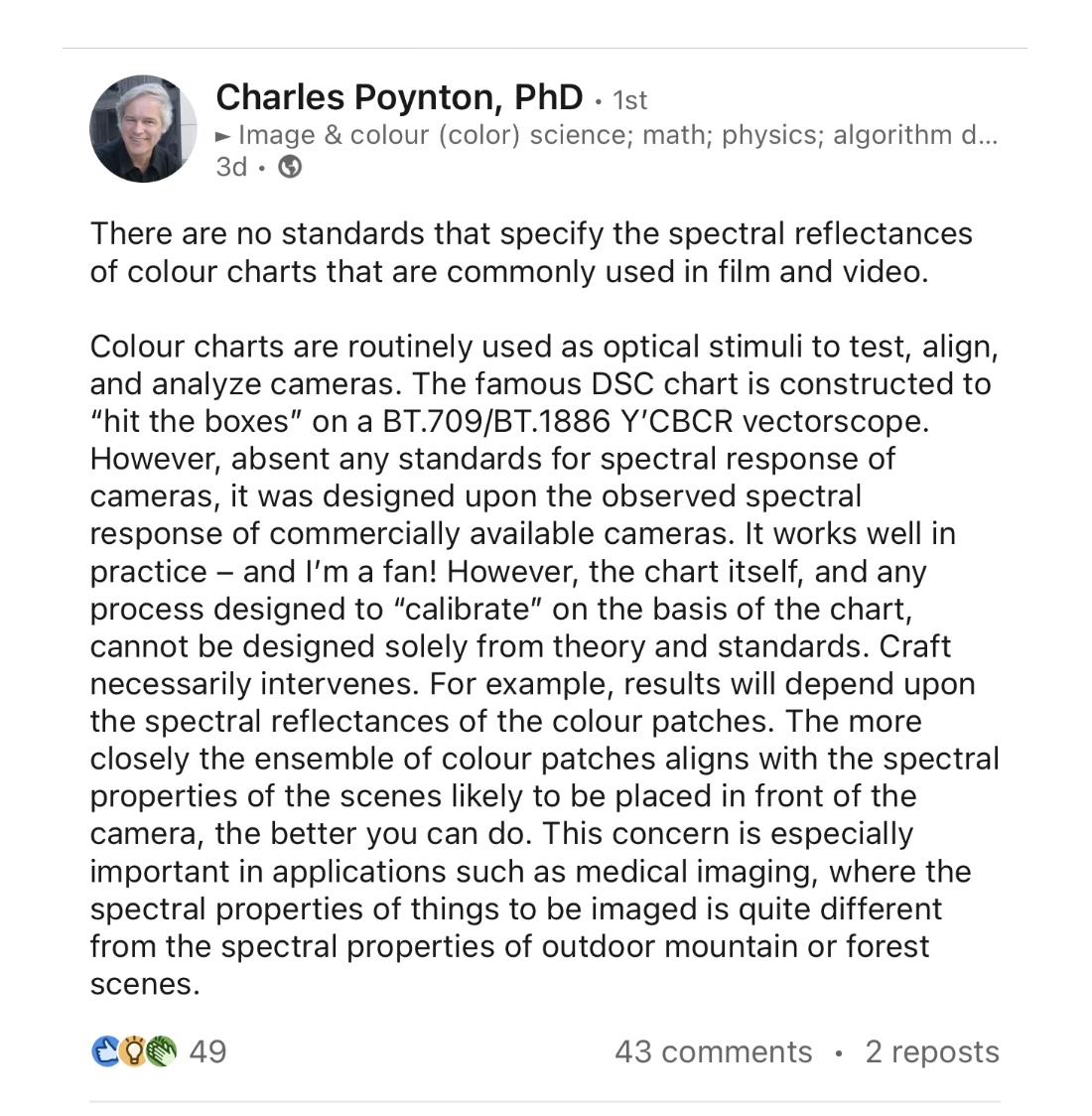
Following public critique, Poynton has subtly altered his phrasing regarding BT.1886, though his underlying conflation persists.
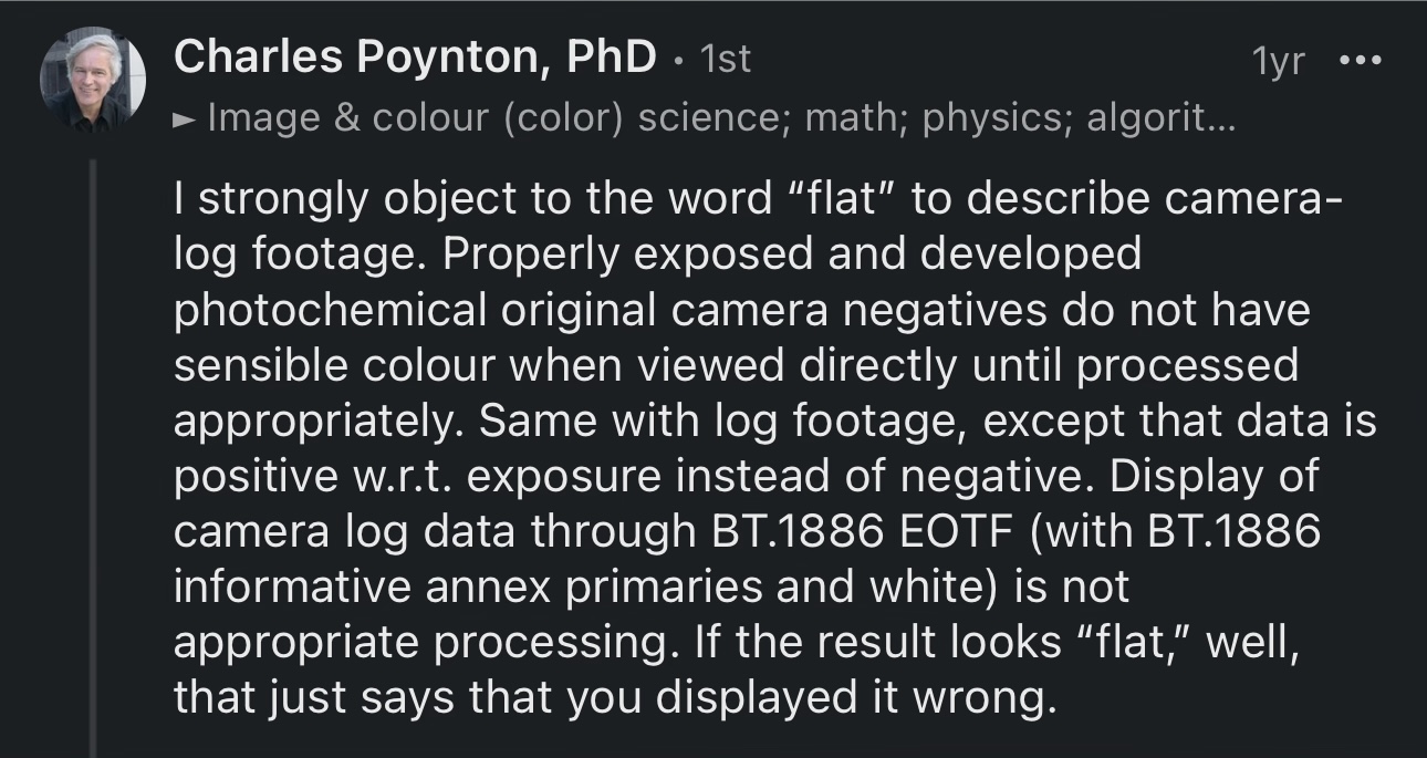
New Statement: “Display of camera log data through BT.1886 EOTF (with BT.1886 informative annex primaries and white) is not appropriate processing.”
Analysis: This phrasing replaces the definitively false claim that “BT.1886 has primaries” with a more technically guarded reference to the informative annex. While this acknowledges that primaries are not in the normative body of BT.1886, it still misleadingly implies a unique or defining relationship between BT.1886 and those primaries. The primaries and white point remain exclusively defined by ITU-R BT.709.
Status: A tactical refinement, not a retraction. The core misconception-that BT.1886 can be treated as a full display color space-remains unaddressed.
Peer-Reviewed Accuracy vs. Social Media Misinformation (July 2025 – Post-Publication)
Despite the accurate terminology used in his July 2025 peer-reviewed paper, Poynton continued to promote the conflation of BT.1886 and color space concepts on social media afterward, demonstrating a persistent commitment to the misleading narrative.
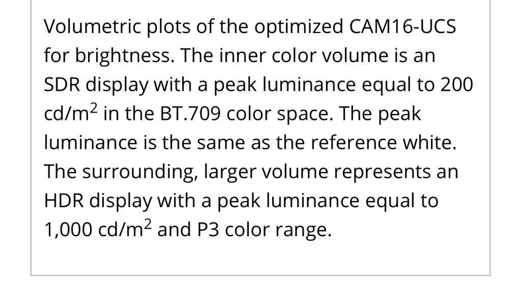
Evidence of Accuracy (July 2025): In the paper Modeling the HDR Display With XCR (Poynton et al., July 15, 2025), the authors correctly and unambiguously identify the source of primaries:
“The inner color volume is an SDR display with a peak luminance equal to 200 cd/m² in the BT.709 color space.”
—Caption for Figure 5, Poynton et al. (2025) This aligns with international standards: BT.709 defines the color primaries and white point; BT.1886 defines only the EOTF.
A Return to Technical Accuracy (Late 2025)
The Breakthrough: Consistent Accurate Terminology
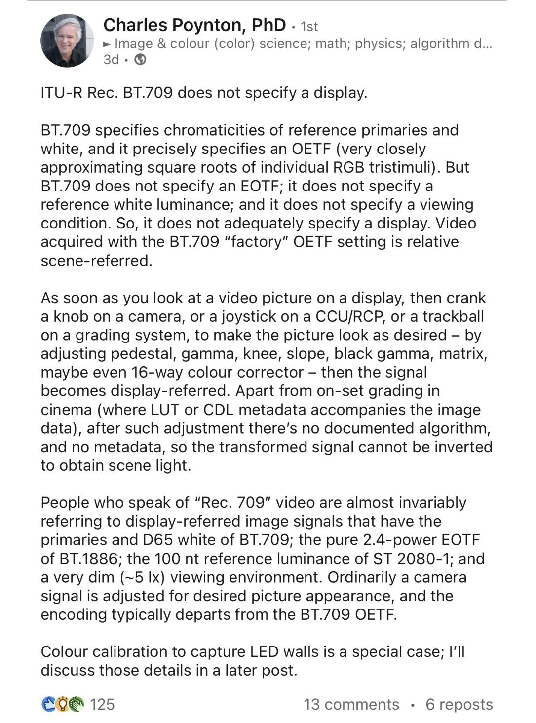
After years of documented mischaracterizations and months of sustained critique, Charles Poynton has begun consistently using technically accurate language when describing the relationship between BT.709 and BT.1886 in his public communications.
Evidence of Change
• Multiple Consecutive Accurate Posts:
• Post 1 (Oct. 2025): Correctly referenced “BT.709/BT.1886” as separate components
• Post 2 (Oct. 2025): Elaborated with precise technical distinctions between standards
• Key Accurate Statements:
• “People who speak of ‘Rec. 709’ video are almost invariably referring to display-referred image signals that have the primaries and D65 white of BT.709; the pure 2.4-power EOTF of BT.1886; the 100 nt reference luminance of ST 2080-1“
• Clear separation: “BT.709 specifies chromaticities of reference primaries and white… BT.709 does not specify an EOTF“
• Significance: Shows that the gates of technical authority are not impermeable to factual, well-documented critique.
The Intimidation Playbook
“Oh, the primaries are in there, they’re just in the wrong type of annex. My bad, I’ll fix that detail.
—Charles Poynton
I’ve already amply documented how the establishment responds to factual criticism—not with counter-arguments, but with gaslighting and doubling down. To those tactics can now be added: credentialism, tone-policing, bullying and threats of ostracization. Charles Poynton’s PM is a prime example:
“Jon, I don’t know why you work SO hard to make enemies. If you continue your confrontational interaction style, you’ll remain stuck on the margins of HDR forever – getting attention from ill-informed random YouTubers, but not taken seriously by the people actually doing the work. I can confirm for you that half a dozen very serious HDR contributors know your name, but consider you to be a nutcase. You could change that. With a more collaborative approach, you could potentially make an impact. For example, your post could be, “Charles Poynton and I agree that ITU-R BT.1886 needs to include primaries and white point as normative elements instead of an informative annex.” There are tons of misconceptions and misunderstandings about HDR; I’ve experienced most of them. I’m an old-timer: I invented the number 1080; I was a member of the committee that wrote BT.709; I was responsible for the introduction of the Adobe RGB 1998 colour space; I discussed with Masaoka-san his development of ’2020 primaries at his meeting room table at NHK in Tokyo months before they were presented to ITU; I have worked deeply inside HDR development since before Dolby bought Brightside. I assure you: There’s no conspiracy. Don’t attribute to malice that which is adequately explained by lack of wisdom. I’m signing off “respectfully,” but you won’t gain any deep respect from the people advancing HDR by continuing your current style. Respectfully, – C”
[Copyright © Charles POYNTON 2025. Permission is granted to quote in entirety, including this notice, but not to excerpt.]
This private message from Poynton is a masterclass in the weaponization of credentials and tone policing. It’s a classic example of an authority figure using a combination of:
1. The Threat: A clear warning of professional ostracization. “you’ll remain stuck on the margins”= “We will blacklist you if you don’t stop.” “considered a nutcase” = “We have a whispered smear campaign against you.”
2. The Bribe: A conditional offer of inclusion. “you could change that,” “with a more collaborative approach” = “If you stop publicly criticizing us and instead parrot our lines, we might let you into the club.”
3. Appeal to Authority: The credential dump is intended to establish hierarchy and force deference. (“I invented 1080…“) = “I am important. You are not. Know your place.”
4. Tone Policing: Focusing on my “confrontational style” to avoid engaging with the substance of my arguments.
5. Gaslighting: Dismissing a clear pattern of misinformation as a simple “lack of wisdom” and denying any coordinated effort. “There’s no conspiracy.” = “The system that benefits me and my friends is just a happy coincidence.”
“Don’t attribute to malice…” = “I’m gaslighting you. My spreading of misinformation was just a simple oopsie, not a willful abuse of authority.”
This is a classic attempt at gaslighting and reality distortion. Let’s break it down:
1. He Creates a False Dilemma: He presents two options: I can be a “nutcase” on the margins, or I can be his collaborator. There’s a third option: stick to the facts, remain independent, and hold him accountable.
2. He Offers a Corrupt “Collaboration”: His proposed headline—“Charles Poynton and I agree…”—isn’t collaboration. It’s capitulation. It’s a demand that I sanitize his error and help him rewrite history.
3. He Confesses Without Confessing: By focusing on the “normative vs. informative” annex, he’s implicitly admitting his original statement was misleading, but he’s reframing it as a minor bureaucratic oversight instead of a fundamental conceptual error. This is a tactic to save face without ever correcting the record.
This is not how a healthy, truth-seeking scientific or engineering community operates.
The snark, the private messaging, the credential-dumping—it’s all the sound of a gatekeeper realizing the gates no longer work.
Proof They No Longer Work
The engineering consensus isn’t with Poynton’s creative reinterpretation of standards. His claim that “half a dozen very serious HDR contributors” dismiss my work is directly contradicted by the support and encouragement I’ve received from key architects of the standards themselves, whose authority on the matter is definitive.
This isn’t a “fight” between Poynton and me. It’s between Poynton and the actual standards themselves—and now everyone knows it.
Charles Poynton: BT.2020 Historical Revisionism
Charles Poynton has repeatedly stated that Dr. Kenichiro Masaoka – the developer of BT.2020 – intended the wide color gamut standard solely as a container, not as a mastering color space.
The evidence shows otherwise.
Masaoka’s correspondence, published papers and presentations show that BT.2020 was engineered as a forward-looking mastering color space, contingent on emerging emissive technologies. Masaoka anticipated a transition period where displays would gradually approach BT.2020 – not an indefinite “container-only” phase.
On an episode of the Color Mentor podcast, while discussing metamerism and the standard observer, Poynton turned to BT.2020 and asserted that it “absolutely should not ever be thought of as a target for content.” He then claimed without evidence that I’d misquoted Dr. Kenichiro Masaoka, alleged that I advocate for BT.2020 as a mastering color space, and implied that Masaoka had developed BT.2020 solely as a container. All three claims are contradicted by the documentary record.
“Don’t try to do 2020 as a target—treat it as a container. And you know, there’s a certain unnamed LinkedIn presence who seems not to understand that, and who believes that 2020 is more than a container. And he then exchanged email with my buddy Masaoka, who’s the guy who computed the BT.2020 numbers. The LinkedIn influencer [air quotes] posted this what I consider to be a misquote from Masaoka saying, ‘Oh, yeah, yeah, yeah. I want it to be the images.’ Well, Masaoka himself understands well that its main use is as a container… [1]”
For context: In my blog, I’d published what is quite possibly the most thorough collection of arguments against BT.2020 as a mastering color space anywhere [2]. So it’s astonishing to hear someone pigeonhole me as an advocate of BT.2020 mastering! In that piece, I cited a paper by LeHoty and Poynton, where it’s claimed that Masaoka had intended BT.2020 solely as a container [3]:
“The BT.2020 developers appreciated that color processing would be necessary in all consumer devices; their goal was to standardize interchange or container primaries, not native device primaries. Nonetheless, some factions today assert that BT.2020 defines a colorspace suitable for program material—in other words, they argue that program material should be allowed to be mastered to the entire BT.2020 gamut. We disagree.”
“We believe that it is a mistake to create programming that addresses the entire gamut of BT.2020 colorspace. To do so risks compromising color image quality for a wide diversity of display devices, particularly in the cinema, where direct-view LED displays are emergent. We argue that BT.2020 colorspace should be considered an interchange or container space, as its developers intended.”
At the behest of a friend, I later reached out directly to Masaoka to settle the matter, writing:
“There appears to be some controversy whether Rec.2020 was developed as native device primaries that would be used to master program material or if it was conceived of primarily to standardize interchange or container primaries. Your input would be very welcome!”
In June 2025, I published Masaoka’s unequivocal reply verbatim:
“The former is correct. I designed the chromaticity coordinates of the BT.2020 RGB primary set assuming the use of laser light sources (cf. IEEE paper attached), but also considered the possibility of achieving over 90% coverage using quantum dots (cf. Optics Express paper attached), which is now considered an appealing design goal in the market [2].”
That’s a far cry from Poynton’s dismissive, “Oh, yeah, yeah, yeah. I want it to be the images.”
The IEEE paper is unambiguous. Section II-C, “Program Quality Management”:
“Program quality management requires that the primaries specified in the image format are physically realizable and common with the reference monitor. That is, every color used in wide-gamut content should be displayable on a reference monitor so that broadcasters can monitor and control the image quality. Thus, the system colorimetry of a television image format and that of the reference display should be consistent with each other so that the reference monitor can reproduce the entire color gamut [4].”
That is Masaoka saying, in his own published paper, that the primaries of the image format and the reference monitor should be the same. That is the opposite of a container.
The paper even classifies different approaches and explicitly rejects the container model:
- Negative RGB is rejected because the extended gamut “includes imaginary or nonphysical colors and the colors that are reproducible depend on the display.”
- Imaginary RGB is rejected for the same reason: “standards or guidelines are necessary for a reference monitor.”
- Wide RGB is selected precisely because “the coding efficiency is optimum when the primaries of the image format and reference monitor are common.”
The entire design philosophy is: the format primaries and the display primaries should be identical. That’s not an abstract mathematical container. That’s a native mastering color space.
The fact that the commercial film industry later hijacked it to use as a hollow “container” for DCI-P3 content doesn’t change the original engineering philosophy laid out in the paper.
This question was revisited at SID Display Week 2026, where a Center Stage panel discussed the utility of the BT.2020 color standard. Significantly, Masaoka was himself a panelist. Chris Chinnock, who attended the discussion, summarized Masaoka’s position as follows:
Container vs. Working Color Space
“The sharpest disagreement on the panel was about what BT.2020 actually is in practice. Masaoka designed it as a working color space — one that current laser, LED, and quantum-dot display technologies can already approach, with simulations showing greater than 99 percent coverage when primaries are positioned close to specification. From that view, BT.2020 is both correct and achievable [5].”
Nothing could be further from Poynton’s mischaracterization.
Jeff Yurek attended Masaoka’s presentation at Display Week and, with the latter’s blessing, shared his presentation slides on Home Theater Geeks [6]. Yurek’s account provides another contemporary record of how Masaoka envisioned the purpose of BT.2020.
He describes NHK’s 2013 end-to-end demonstration, in which 8K video was sent to a 12-bit laser projector “to reproduce BT.2020,” and observes:
“I think what he’s interested in showing the world is, ‘Hey, I really do intend this to be a display gamut.’”
Addendum (August 2026)
After publication, I came across a LinkedIn comment by Dr. Masaoka from seven months earlier in which he makes the same point publicly:
“One key intent behind BT.2020 was to define primaries that efficiently cover Pointer’s Gamut with three primaries… At the same time, BT.2020 was not meant to be purely theoretical in the sense of being only a container; practical realizability was also part of the thinking, especially for laser projectors and for displays using laser or other narrowband backlights. In fact, I built and evaluated prototypes along those lines, including comparisons of BT.2020 vs. P3 behavior in practice.”
He attached the same IEEE paper cited above.
- Charles Poynton, Color Mentor Podcast Episode 13 – Charles Poynton Interview, Chapter 32: Rec 2020 as container not target gamut, Color Mentor YouTube channel, Jan. 31, 2026
- Jon Pais, Beyond the Hype: The Hidden Costs of Grading HDR in Rec.2020, Daejeon Chronicles, June 2025
- David A. LeHoty and Charles Poynton, “Comparing Displays Using Luma Contours and Color Volumes,” Information Display, Vol. 36, Issue 5, pp. 16–21, Sept. 19, 2020.
- Masaoka, K. Design of Primaries for a Wide-Gamut Television Colorimetry. IEEE Transactions on Broadcasting 2010; 56(4): 452–457.
- Chris Chinnock, BT.2020: Container, Color Space, or Catalyst?, Insight Media, May 14, 2026
- Jeff Yurek, All About BT.2020 – The Ultimate Range of Colors, HomeTheaterGeeks YouTube channel, June 12, 2026
“HDR Is SDR”
I’ve documented time and again how Charles Poynton is willing to embellish the truth to push his narrative, and this time is no different.
During an episode of the Color Mentor podcast [1], Charles Poynton insists that cinema audiences can’t handle BT.2020 colors; that there’s an industry trend of “bigger, brighter, and more colorful” driven by “marketers” to make things look impressive on a spec sheet; that at its core, HDR is SDR; that the film industry is going through the equivalent of the “loudness wars” in music; that the range from black to diffuse white of HDR must be identical to that of SDR or else it ‘fails’; and that SDR must be the foundation of your grading workflow—even when working in HDR.
I evaluate the claims one by one.
Audiences Don’t Watch a Color Space – They Watch a Movie
Quote:
“Can cinema audiences handle these ultra hyper saturated colors and do they find that a pleasant experience? The answer is almost certainly no.”
Claim: Audiences can’t handle BT.2020 colors.
Fact Check: This is just one of many sweeping generalizations Poynton makes on the show. To begin with, exceedingly little commercial content is mastered using BT.2020 primaries. When it is, it typically concerns an infinitesimal 1-2% of the pixels. Not only that, but you don’t build a BT.2020 pipeline to make the entire screen look like a neon rave. You build it because the story demands it.
Case in point: John Daro’s 4K UHD restoration of the Wachowskis’ Speed Racer. Hailed as a reference-quality visual and auditory showcase, the remaster was an unqualified critical and commercial success. Daro noted that the Wachowskis were thrilled with the finalized HDR pass, which fully realized intended color boundaries that were technically impossible during the 2008 master. Daro writes:
“In some rare, highly specific instances, we actually pushed the grade outside the P3 gamut and into extreme 2020 colors. To my knowledge, this is a first for a Remastered Warner Bros. disc. I felt the timing was finally right; with modern display manufacturers like LG and Samsung producing consumer panels capable of rendering these extreme wide-gamut colors, it was time to let Speed Racer completely off the leash [2].”
Marketing Doesn’t Dictate Color Pipelines
Quote:
“There’s this rather large group, unfortunately, of what I will classify—and it’s not necessarily a compliment—marketers, who think we need to go bigger, bigger, bigger, brighter, brighter, brighter, more and more and more colorful.”
Claim: There’s an industry trend of “bigger, brighter, more colorful” imagery driven by marketing to make things look impressive on a spec sheet.
Fact Check: Let’s just pause for a moment to acknowledge that “bigger” is objectively better.
As for the remainder of Poynton’s allegation, industry standards, studios and professionals reject the simplistic “HDR = Brighter + More Colorful” narrative.
The Brighter, More Colorful Fallacy
Paolo Centofanti, senior tech editor at the Italian website Digital Day, had a chance to visit Company 3, the outfit responsible for the post-production of 80% of Hollywood movies and series. He wrote [3]:
“During our visit we had the opportunity to talk at length about HDR with the various colorists and the surprising thing is that everyone wanted to emphasize that although the marketing of TV manufacturers focuses a lot on peak brightness, the benefits of HDR formats have nothing to do with brighter images.”
Colorist Cody Baker explained:
“We don’t want viewers to be dazzled or annoyed. There are rarely shots in which it makes sense to push details up to 1000 nits, if not in a science fiction movie for special effects like lasers.”
When told about the announcement of a new 10,000-nit TV, Baker burst out laughing before erupting with “that’s bullshit.”
Reality Check: The “Brighter” Strawman
Professionals don’t build color pipelines based on marketing taglines. In fact, the international standard ITU-R BT.2390 (2016) directly refuted the idea that HDR is “all about brighter pictures” a decade ago:
“…there are a number of frequent misconceptions about HDR video, such as: ‘It is all about brighter pictures’… The misconception about HDR being simply brighter pictures arises from the fact that the maximum luminance capability is indeed much higher than standard dynamic range (SDR) television. However, this higher maximum is primarily used by the highlight regions of images. While the highlights will indeed appear brighter, they are nearly always small in region, and the overall image may not necessarily appear brighter [4].”
The SMPTE ST 2084 standard flatly rejected the brighter fallacy a dozen years ago:
“This EOTF is intended to enable the creation of video images with an increased luminance range; not for creation of video images with overall higher luminance levels [5].”
Studios Don’t Mandate Brighter Pixels
In 2019, the major Hollywood studios issued a joint statement asserting that the brightness or darkness of each shot of a film is entirely up to the filmmaker:
“It is also worth highlighting that a critical feature of the HDR system developed by DCI is one of creative expression. An HDR DCP need not exercise the entire range of brightness offered by the HDR specification. Despite the peak luminance that an HDR system is capable of, the brightness or darkness of each shot of a movie is always up to the filmmaker. It is not up to the HDR projector or display, which simply provides the full range of capabilities. DCI seeks to ensure that the headroom required to reproduce a filmmaker’s creative vision exists, whether that be the darkness of a cave, a candle, a car’s headlights, a meteor, or sunlight spilling through a window [6].”
Netflix similarly leaves decisions about luminance up to filmmakers:
“Netflix executives make no demands regarding dynamic range, brightness values, contrast reproduction, etc. Instead, they leave the implementation of HDR up to the filmmakers [7].”
The Statistical Truth
HDR video content typically has a low APL (<20%).
In a study [8] of 41 Warner Bros. titles (over 7 million total frames analyzed, corresponding to approximately 83 hr of content) in the HDR Home format that were mastered on a Dolby Pulsar display (0.005 cd/m2 black level and a peak luminance of 4000 cd/m2), MaxFALL (maximum frame average light level) of 98.6% of the frames was below 170 cd/m2 (the display power budget of the BVM-X300).
Dolby Dispels “Brighter” Fiction
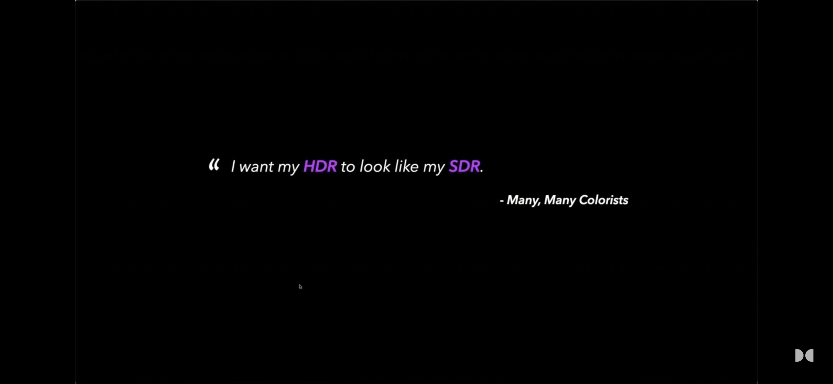
“I bet you’ve probably heard this one too: ‘I want my HDR to look like my SDR.’ This is a very reasonable statement. We have this look we’ve crafted over months or years; we’re in love with it. It was imagined, filmed, edited, and reviewed under it. Then we get to the grading suite, turn on the HDR switch, look at both, and the natural inclination is to say, ‘Let’s make the HDR look like the SDR’ [9].”
—Samuel Bilodeau, Product Manager, Imaging Content Solutions, Dolby Laboratories
The “More Colorful” Strawman
When asked why DCI specified P3 primaries rather than BT.2020 in their DCI High Dynamic Range D-Cinema Addendum, they replied:
“DCI had to weigh the creative value of BT.2020. We’ve worked closely with colorists in attempts to demonstrate the value of colors outside of DCI-P3, and those attempts have been far from compelling. In general, colorists prefer to reduce color saturation. This isn’t entirely without exception, of course, as there have been some notable examples of studios utilizing color values far outside of DCI-P3 but they’re extremely limited… Nonetheless it’s been difficult to make a compelling case for the real creative value there. So, given all the challenges to achieve 100% BT.2020, the lack of any standard that describes a realistic subset of BT.2020, and the doubtful creative value, DCI opted to retain DCI-P3 as the color gamut for the D-Cinema HDR specification/standard [10].”
Historical Revisionism
Quote:
“Here’s an analogy for you from the music business… Even in the ‘90s, maybe even in the 2000s, there’s a dynamic. There’s modulation. And what you see today is a flat line. They’ve raised the average loudness as high as they can get it to the penalty of putting everything in the same dynamics. Where in the ’90s and the 2000s, pop songs were dynamic… But pop music today doesn’t have that. So it’s a missing of the dynamics and we call this new technology High Dynamic Range. So in principle, it’s there to do dynamics. But the dynamics require high level in a certain part and then a low level in another part. And it’s that playing back and forth between them that literally makes the dynamics.”
Claim: The equivalent of the “loudness wars” in music is taking place in the film industry.
Fact Check: There’s just too much to unpack here. First of all, there’s Poynton’s jaw-dropping, sweeping generalization: “‘90s pop was dynamic… but pop music today doesn’t have that.”
Moreover, contrary to Poynton’s claim, in audio, there is no High Dynamic Range standard as there is in video.
Furthermore, calling ‘high dynamic range’ in music “new” in 2026 is historically illiterate: dynamic range is the default state of acoustic music. Classical music has utilized extreme dynamic range for centuries. Engineers have been able to capture that range for nearly half a century.
Not only that, but dynamic range in music is temporal whereas in HDR, it’s primarily spatial. HDR is not at all about a “high level in a certain part and then a low level in another part.”
Last but not least, Poynton’s analogy is inverted: music history is a timeline of trying to reclaim the natural dynamics we lost during the ‘loudness wars,’ whereas the history of HDR filmmaking is the exact opposite: filmmakers have been intentionally reducing dynamic range almost since the inception of commercially available HDR:
“When high dynamic range first came out, every studio wanted… ‘We want our high dynamic range version of this show to like, you know, go up to 11 and hurt people!’ And you know, over time, if it’s something that benefits the creatives, they’ll adopt it, but then it tones down. Then it just becomes part of their tool set [11].”
—Joshua Pines, Chief Color Scientist, Picture Shop
A tech commentator confirms:
“The biggest blockbusters of 2025, F1 The Movie, Superman, and Jurassic World Rebirth, all have one thing in common: they all look dim. I’m talking about specular highlights barely crossing 300 nits on one of those movies. The other two movies, well, one of them didn’t cross 200 nits, and the other one barely broke 100 nits. Actually, I don’t think it ever broke 100 nits. Isn’t that SDR? While today’s entry-level TVs can handle 1,000 nits, with flagships easily pushing over 3,000 nits. And Hollywood’s newest, latest reference monitor, the Sony BVM-HX3110, was designed specifically for HDR content, handling peak specular highlights of 4,000 nits. And yes, it was used to grade the movie F1. As a matter of fact, F1 was one of the first releases to ever use this monitor. So here’s the paradox: TV makers keep raising the brightness level for HDR content while the actual studios that make HDR content have gone the other way, lowering the HDR brightness. What gives? [12]”
Contrast: A Pillar of HDR Quality
Quote:
“HDR is just SDR plus specular highlights. At core, it’s just SDR.”
Claim: HDR = SDR + highlights
Fact Check: Cf. Yedlin’s reductionist “HLG (in effect if not in name) is just yet another SDR colorspace” and “BT.2020 is an SDR colorspace.” HDR was designed to expand both luminance range and contrast, not just achieve higher peak brightness. Chen et. al.’s groundbreaking study established that contrast is a pillar of HDR quality: HDR = Contrast + Peak Luminance [13].
HDR Is Just SDR—So Grade SDR First
Quote:
“You’ve got to get the SDR right in order to get the HDR right. That’s got to be your starting point.” “The most important thing about HDR is make sure you get the range from black to diffuse white correct. That remains critical. You got to make that the same [as SDR], otherwise you fail.”
Claims: (1) SDR must be the foundation of your grading workflow, even when working in HDR. (2) The range from black to diffuse white in HDR must be identical to that of the SDR grade.
Fact Check: Poynton instructs colorists to reverse the industry mandated order of operations.
What is SDR-centric grading?
SDR-centric grading refers to the workflow order: first, a full creative grade is established for the SDR version of the content, and then the HDR version is created from that SDR master. It is a ‘bottom-up’ approach.
How does SDR-centric grading harm HDR?
SDR-centric grading bypasses the need to engage with HDR. It undermines HDR’s potential, resulting in the “overly reserved” HDR that specifications like Sky UK’s [14] caution against.
What does ‘start at the top’ mean?
Starting at the top means the HDR grade is done first. This is the prevailing industry standard ‘top-down’ approach. An SDR version is then derived from the HDR master.
The ‘top-down’ approach is recommended because it makes HDR the primary creative canvas. For optimal results, the industry recommended practice is unequivocal:
Do I grade HDR first? SDR first? Or do both at the same time?
“The HDR should be graded first, followed by a Dolby Vision analysis of the HDR image and a shot-by-shot trim pass of the entire program. It is our experience that – generally speaking – you will get the best results out of both the HDR and the SDR grade if you grade the HDR version first and approach that as the ‘hero grade’” [15]—Netflix
HDR Is the Primary Deliverable
“I think what’s interesting now is that three or four years ago, quite rightly, every director and DP came in here and said ‘Why are we doing the HDR version? No one’s going to see this.’ But of course, that’s not the case now… So I think it’s probably unfair to say that it’s an also-ran now, the HDR. I think actually the primary delivery is the HDR for people. And every 6 months that go on, that tilts even further. So I think now, it’s a big change… there will come a time when the SDR just isn’t needed [16].”
—Thomas Urbye, CEO and Colorist, The Look
For the Best Theatrical Result, Do the Dolby Vision First
“I used to own a post house called Light Iron… we worked on Spider-Man and Pirates… these major cinematographers would come in. And as we saw this transition to streaming and HDR… some of them would resist it… they would say, we’re going to color for theatrical first… I respected that approach… But the cinematographers that said, let’s do the Dolby Vision first… I have put so many hours into this process… you actually get a better result on your theatrical if you do a Dolby Vision first. Because Dolby Vision gives you the ability to see truly everything which the DLP cannot deliver. It can’t produce the resolution and the color and the contrast and the dynamic range that exists inside your original camera negative, which is displayed on a Dolby Vision display… when you corrected for Dolby Vision on a primary display, not only was that almost perfectly emulated in the home theater experience, your theatrical experience benefited from it [17].”
—Michael Cioni, CEO, Strada
During a 2017 GDC presentation about the Frostbite Engine, Alex Fry’s message was categorical:
“HDR is the reference in Frostbite; SDR is just an artefact of the display mapper.” He urged developers to “master your content in HDR and treat the HDR as a reference version by all means… try to master your game in the widest possible space. Master in HDR and then produce every version of that as an artefact.” He concluded: “It’s in all of our interest to try and drive the adoption of HDR. It is a lot better [18].”
Why This Matters
The SDR-first pipeline is a direct path to artistic bankruptcy.
Poynton says the range from black to diffuse white in HDR must be identical to that of the SDR. Colorists might try to keep middle gray (18% gray) anchored at the same perceived brightness between SDR and HDR, but there is no hard-and-fast rule.
Aurora Gordon, a senior colorist at ArsenalFX Color, presented data from over 35 HDR episodes at a 2019 SMPTE conference, exploring HDR’s psychological impact. She compared contrast ratios between the SDR grade and HDR trim pass across three genres (medical drama, superhero comedy, spy thriller). Although the HDR pass targeted 1,000 nits, the mean picture level was actually lower on all three shows compared to SDR—though overall contrast increased as expected.
Upon examination of the contrast of the HDR trim pass, it was found that in some cases, both the key and fill sides increased; at other times, the key side increased while the fill side decreased; and at times (in very dark scenes), both the key and fill sides of the faces decreased – underscoring the necessity of tailoring color adjustments to artistic intent rather than adhering strictly to rigid nit targets [19].
Brightness Serves the Story, Not the Technology
Quote:
“Today, HDR would be mastered at a 1000-nit peak, 200-nit reference – which some people would call diffuse white.”
Claim: HDR is routinely mastered to a 1000-nit peak and 200 nits reference white.
Fact Check: (1) Poynton is conflating mastering monitor peak luminance with the actual peak highlights in the program material. Seldom in narrative filmmaking or episodic TV do we see figures like those. (2) HDR reference white does not exist in narrative filmmaking and episodic television.
“I don’t have a hard rule or setting that I use. [It] depends on the project. I rarely peak things at 1,000 nits. Most people don’t react well to things being that bright. I generally start with a roll off but I could still go up to 600 nits. If it’s a much softer show, we’ll maybe do 300 nits—maybe even less [20].”
—Corinne Bogdanowicz, Co-Founder and Colorist, Light Iron
“David [Fincher] early on was looking at HDR scenes and quickly realizing that for him, a lot of it was distracting. Especially some of these light sources could be so much more prominent than really was intended… This was the case for a lot of scenes. So he sort of determined the speed limit of our HDR to be around 600 nits [21].”
—Eric Weidt, Colorist
“I know of a major — think $100 million+ — 2022 feature where the director came in and said, “ya know what… I prefer the SDR picture. Don’t make it much brighter than that. You can let the specular highlights stray up to 300, 400 nits, but other than that, keep everything about where it is.” Huge movie, already shipped, nobody cared or noticed. And this is a huge A-list director nobody was going to argue with.”
—Marc Wielage, VP/Color & Workflow, Chroma
The Reference White Myth
“…despite ITU recommendations, most theatrical and episodic HDR content does not have a diffuse white level of 203 nits. The diffuse white level in such content usually changes from scene to scene, and is far closer to the typical diffuse white level of SDR content of between 80 and 100 nits at most [22].”
—Neil Robinson, Display & Color Technologist, Apple
FilmLight Image Engineer Daniele Siragusano explains the origin of the “reference white” myth:
“The 200 nits for graphics white are chosen for compatibility with SDR in simultaneous live broadcast of HLG. In simultaneous broadcast you have the issue that the same HLG signal is shown on an HLG and 2.4 gamma Rec.2020 monitor. If you acknowledge the fact that SDR 2020 monitors are typically set to 200-300 nits peak you need to make the diffuse white in the HLG signal brighter. Otherwise the signal would look darker on the HDR monitors compared to the SDR monitors. All of this is not applicable to motion picture and hence we did not follow ITU-R BT 2408 [23].”
This underscores the idea that many early HDR “standards” were about making HDR look acceptable to eyes accustomed to SDR, rather than exploring HDR’s true potential.
The following paragraph, from Section 2 of ITU-R BT.2408, “Reference levels and signal format,” is universally disregarded by those who insist on a rigid application of the reference levels listed in Table 1:
“During set-up, camera controls such as gain and shutter and others may be pre-adjusted to make best use of camera sensor capabilities, i.e. a balance between signal to noise ratio (SNR) and achieved sensor peak capability, and to establish a creative intent. During capture, the exposure may then be adjusted taking consideration of the reference levels listed below as well as the creative intent [24].”
The report explicitly subordinates reference levels to the creative choices of the filmmaker. It is a guideline for technical line-up in live production, not a creative straitjacket.
The “200 nits for white” isn’t a creative target; it’s a compromise for a specific, hybrid broadcast scenario. In film and television drama, the “correct” level for diffuse white is wherever the storyteller puts it.
Footnotes
- Charles Poynton, COLOR MENTOR PODCAST Episode 13 – Charles Poynton Interview, Color Mentor YouTube channel, Jan. 31, 2026
- John Daro, Go Speed Go: Remastering the Hyper Color World of Speed Racer in 4000-Nit HDR, John Daro blog, May 19, 2026
- Paolo Centofanti, Hollywood Colorists: TV Marketing Is Wrong. With HDR The Important Thing Is Not Brightness, January 2024
- Report ITU-R BT.2390-1 (10/2016)
- High Dynamic Range Electro-Optical Transfer Function of Mastering Reference Displays, SMPTE ST 2084:2014
- Digital Cinema Initiatives, LLC
- Jay Holben, ASC, Netflix Helps Drive the Creative Vision with High-Dynamic-Range Content, American Cinematographer. (Dec. 2019)
- Ronan Boitard, Michael Smith, Michael Zink, Gerwin Damberg, and Anders Ballestad, Predicting HDR Cinema Requirements from HDR Home Master Statistics, SMPTE Motion Imaging Journal, Volume 128, Issue 3 (21 March 2019)
- Samuel Bilodeau, Product Mgr., Imaging Content Solutions, Dolby Laboratories, Webinar (Spring 2024)
- Venue, DCI (Digital Cinema Initiatives) D-Cinema HDR, AVSForum (Jan. 24, 2023)
- Color Masterclass with Joshua Pines & Maxine Gervais | Color Matters S2 E8, Portrait Displays YouTube channel, Jan. 17, 2024
- HDR Paradox: dimmer movies 10 years later! What happened to HDR?, Stop the Fomo YouTube channel, Sept. 4, 2025
- Kenneth Chen, Nathan Matsuda, Jon McElvain, Yang Zhao, Thomas Wan, Qi Sun, Alexandre Chapiro. 2025. What is HDR? Perceptual Impact of Luminance and Contrast in Immersive Displays. In SIGGRAPH ‘25: Proceedings of the Special Interest Group on Computer Graphics and Interactive Techniques Conference. ACM, New York, NY, USA.
- Ashley Ross, Technical Specification for the Delivery of Content to Sky UK, V1.2, March 2023
- FAQs, Dolby Vision HDR Mastering Guidelines, Netflix
- Thomas Urbye, Color Tour Podcast S4 EP06: Thomas Urbye, Noho, UK, August 7, 2023
- Michael Cioni, S6 E5 of The T Stop Inn, 21 March 2025
- Alex Fry (Frostbite Team, Electronic Arts), High Dynamic Range Color Grading and Display in Frostbite, GDC (2017)
- Aurora Gordon, SMPTE 2018: Beyond Better Pixels: How HDR Perceptually and Emotionally Effects [sic] Storytelling, smpteconnect YouTube channel, Jan. 29, 2019
- An interview w/ Corinne Bogdanowicz, Cullen Kelly YouTube channel (June 20, 2024)
- Eric Weidt, Colour on Stage: Eric Weidt, FilmLight YouTube channel, Dec. 3, 2019
- Neil Robinson, EP950 Ultrafine OLED Pro Monitor Best Practices and Additional Usage Information, LG ELECTRONICS (JUNE 25, 2021)
- Daniele Siragusano, ACES Central, May 2025
- Report ITU-R BT.2408-9, BT Series: Broadcasting service (television), Guidance for operational practices in HDR television production (09/2023)


Leave a Reply