Part I: Project settings, Project Render Settings, Generate MaxCLL and MaxFall HDR10 Metadata
Part II: RAW
Part III: The Grade
Note: The information in this guide is continually revised and expanded and the reader is urged to check back occasionally for updates. The current recommendations are valid as of macOS Tahoe version 26.3.1, DaVinci Resolve Studio 20 and Desktop Video 14.3. RED Komodo project settings have been added to Part II: RAW.
Since publishing our exhaustive workflow for HDR10 in Final Cut Pro, we’ve been inundated with requests to do the same for DaVinci Resolve – and with the introduction of customizable HDR color wheels that allow extremely precise exposure and color adjustments from super blacks to specular highlights in Resolve Studio 17, a terrific NLE just got even better! It’s baffling how to this day the single greatest contribution to cinema since the talkies remains woefully neglected by many in the filmmaking community and that there exists in 2021 no one-stop source with concise, accurate, up-to-date information for the enthusiast on the acquisition, processing and delivery of HDR video. Our goal was twofold: (1) to make this tutorial as intelligible as possible and (2) to inspire even more filmmakers to discover the incredible universe that is HDR. In part one, we’ll cover the project settings you’ll need to grade HDR10 in Resolve and how to configure your LG OLED for use as an HDR grading monitor.
HDR: Disruption or Natural Progression?
“I think cinematographers have always advocated for a better experience for the audience, whether it’s fast film stocks with tighter grain, better projection technology, or higher quality digital-capture and display technologies. HDR is just another step in that direction.” Erik Messerschmidt, ASC
“The trajectory of that film technology, Kodak and Fuji together, working toward, every year, sharper, higher dynamic range, darker darks… This isn’t a new phenomenon, just because it’s digital. And you’re right: the sort of step-change and the sort of brute force capability that we have now with a lot of these technologies, it speaks to the language of cinema. Yeah, it’s magic tech, it’s shiny, it’s a great toy, but it’s not an accident and it’s not… It’s built with a very deliberate path through the language of cinema, and that vector, that trajectory, where it’s headed, is still the same direction: it’s better, it’s darker, it’s brighter, it’s more colorful – it has always been that trajectory.” Dominic Glynn, Senior Scientist, Pixar Animation Studios
“[T]he move to HDR is as significant as any shift in the history of motion imaging. And that includes evolutions such as the shift from 18 frames per second to 24, black and white to color, and standard definition to high definition… HDR isn’t simply about a more impressive image. Instead, it represents a fundamental improvement to the way we approach and talk about image mastering, one that better reflects the native language of light and photography.”
“Technical details aside, the most important thing to understand about HDR is that it doesn’t represent an enhancement as much as the removal of an artificial limitation. In the realm of human vision and physical light, high dynamic range is a default condition, not an added gimmick.” Cullen Kelly, Colorist
Noteworthy HDR Movies, TV Series & Games
Netflix
The gritty French action crime drama Ganglands (2021) has enlivening camerawork and good grading. The 19-minute animated short Bad Travelling (Love, Death + Robots, Season 3, 2022), directed by David Fincher, is the strongest episode in the entire anthology, and is nothing short of sensational.
Sky Rojo (2021-2023), a high-octane exploitation film from the creators of Money Heist, has exemplary photography. Then there’s the Swedish biopic drama/comedy Clark (2022), with excellent lensing by Eric Broms and remarkable grading by Bill Ferwerda.
The brutally violent Polish action movie Mother’s Day (2023) has little to recommend itself as far as the script goes, but we confess to having enjoyed the production design, the widescreen anamorphic cinematography, some of the fight choreography and the actress Agnieszka Grochowska, who appears to do a lot of her own stunts in the picture.
The Hindi-language comedy/crime/drama Tribhuvan Mishra: CA Topper (2024- ), with cinematography by Anuj Samtani and grading by Avinash Jagdish Shukla, has sharply divided critical opinion, but we found it hugely entertaining.
Sanjay Leela Bhansali’s biopic Gangubai Kathiawadi (2022), shot by Sudeep Chatterjee and graded by Ashirwad Hadkar, is a virtual masterclass in HDR. Lastly, there’s the Korean zombie series All of Us Are Dead (2022), with good use of HDR’s extended range.
Apple TV+
Emancipation (2022), shot by Robert Richardson, ASC, is visually stunning. The true crime drama miniseries Black Bird (2022), with DP Natalie Kingston at the helm, benefits from magnificent cinematography. Lessons in Chemistry (2023), with lensing by Zachary Galler and Jason Oldak and grading by Ian Vertovec, is exquisite. None of Apple TV+’s recent shows – Murderbot, The Studio, Carême, Your Friends & Neighbors, Dope Thief, Wolfs, Presumed Innocent – have any HDR intent whatsoever and are mastered to SDR levels.
PlayStation Studios Games
Streamed content on platforms like Netflix seldom approaches the raw visual impact of a well-implemented HDR game on high-end hardware.
The following Sony PlayStation games have excellent HDR implementation: Ghost of Tsushima (2020), Ratchet & Clank: Rift Apart (2021), Gran Turismo 7 (2022), The Last of Us Part II Remastered (2024), Days Gone Remastered (2025), Ghost of Yotei (2025), and God of War (2018). The cutscenes and cinematic interiors (e.g., Matrix 11) of Stellar Blade (2024) have effective HDR, but the open-world areas—the Wasteland and the Great Desert—suffer from raised black levels.
Multi-Platform Games
Battlefield 1 (2016), Battlefield V (2018), Metro Exodus (Enhanced version, 2021), S.T.A.L.K.E.R. 2: Heart of Chornobyl (2025), and Doom Eternal (2020) all deliver exceptional HDR. It’s ironic that as games like these lean into the contrast essential to HDR, modern film and TV are moving in the opposite direction. Gears of War: Reloaded (2025) is decent.
“HDR Doesn’t Really Change Anything But The Grading Pass”
Many cinematographers and colorists repeat the fiction propagated by the likes of Kevin Shaw that HDR is nothing more than an ‘effect’ added in post and that DPs don’t have to shoot any differently.
“A few years back, a couple of years back, the consensus really was that HDR doesn’t affect anybody: you don’t have to shoot differently, you don’t have to edit differently; it’s really just an extra step in the grading. And I think over the last couple of years, we’ve really learned a lot and we’re still learning, so we’re not there yet, but we’re still learning; but in theory, it doesn’t really doesn’t change anything but the grading pass.” – Kevin Shaw, President of Colorist Society International (CSI).
Steven Poster, former President, ICG IATSE Local 600, disputes that idea:
“Five years ago, Local 600 made its first presentation to an organization called the HPA (The Hollywood Postproduction Alliance, now HPA/SMPTE) on the importance of using calibrated on-set monitoring and the position of the DIT. We were treated as something of curiosity, because the thought at that time was ‘shoot it in RAW and we’ll take care of the ‘look’ in post’. But now, after numerous panels and industry discussions, virtually everyone who talked about the artistic look at their last annual conference said that the “look” is determined on-set by the director of photography with the assistance of the DIT. Even when they don’t always do the right thing, at least saying the right thing is a start.” – Steven Poster, ASC, President, ICG IATSE Local 600
HDR is an end-to-end process, from capture and post-production to storage, distribution and display. In order to be successful, the color, contrast and highlight and shadow detail, as well as the compositional choices that make effective use of HDR need to be evaluated on set, thereby ensuring that the look/emotional impact travels through all the way to the final deliverable.
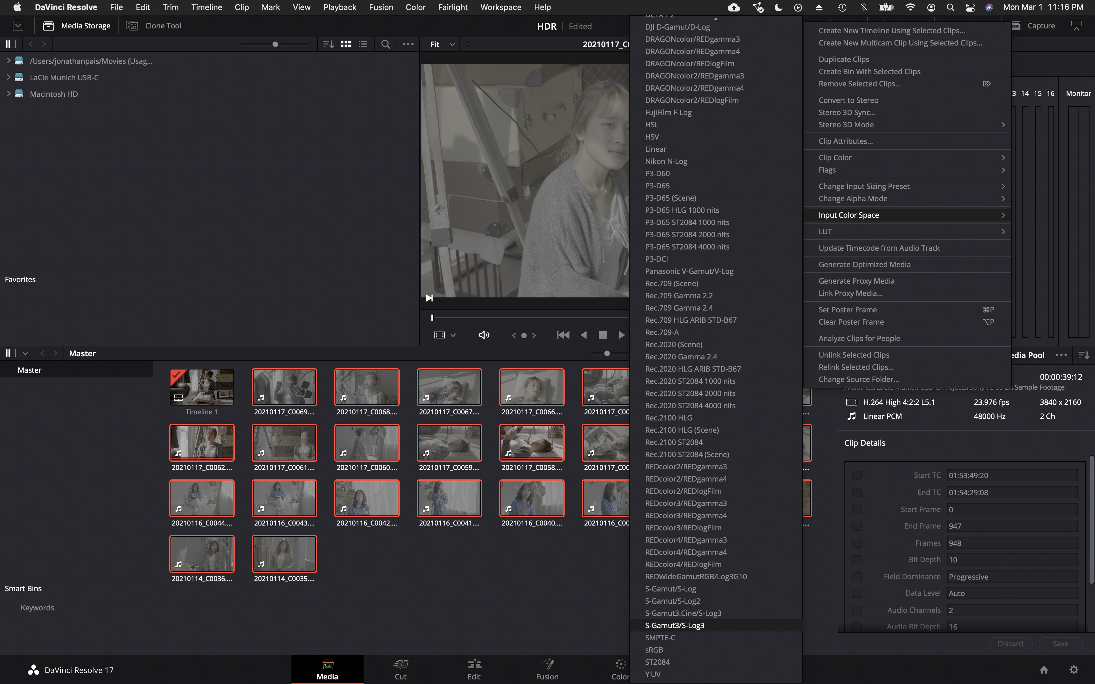
S-Gamut3 or S-Gamut3.cine?
In picture profile, select either S-Gamut3/S-Log3 or S-Gamut3.Cine/S-Log3. For what it’s worth, S-Gamut3.Cine/S-Log3 is the most common color space used on Sony FX9, F55, FS7, F5 and FX6 Netflix productions (which also happen to use the P3-D65 color space in post-production). We’ve also been informed that key mastering engineers at Sony Pictures in Culver City recommend selecting the S-Gamut3.Cine/S-Log3 settings in Resolve.
Note: Virtually every custom LUT developed for Sony S-Log3 is for S-Gamut3.Cine, including those created by Technicolor and Picture Shop in collaboration with Sony for their flagship cinema cameras, the Venice and Venice 2, so that might be something to consider when deciding which gamut to select.
Art Adams had this to say about choosing gamut:
“While the temptation to use full S-Gamut3 is probably overwhelming to some, it’s best to ask yourself (1) when will the extra color be displayable, (2) will your project still be marketable when that happens, (3) are you shooting anything that takes advantage of that color space, and (4) do you have the talents of a professional and expert colorist at your disposal. If not, SGamut3.cine is clearly the better choice. If your project has a long shelf life and would look great with rich saturated color then SGamut3 will protect all that, but you won’t be doing the Rec 709 or P3 grades yourself: you’ll need skilled professional help.”
Then there’s this advice from Sony Professional:
”There is a lot of confusion regarding S-Gamut3 and S-Gamut3.Cine. Essentially the difference is S-Gamut3 is the native (very wide) color space of the camera, and is wider than REC-2020. It is very good for archiving as a digital camera negative, as transcoded / debayered up to16 bit code values. However, it is much more involved to grade footage than if shot using S-Gamut3.Cine. Whereas S-Gamut3.Cine is natural color reproduction with minimum grading needed in comparison to SGamut3, it is still a wide color space, beyond DCI-P3, and much wider than REC-709. We recommend shooting S-Gamut3.Cine most of the time. The Look Profiles, and 709 3DLUT’s provided in the camera, and in Sony’s RAW Viewer are designed specifically for S-Gamut3.Cine, not for S-Gamut3. If you choose to shoot S-Gamut3 you need to convert to S-Gamut3.Cine with the 3DLUT provided below, “SLog3SG3toSG3Cine.cube”, then in addition apply Look Profiles or other type 3DLUT provided with the camera and in Sony’s RAW Viewer. In other words you need to apply two 3DLUT’s. If you are experienced at Color Grading, you can indeed shoot S-Gamut3, but as mentioned above it is much more work than if shooting (and thus grading) S-Gamut3.Cine.”
Displays
In spite of bizarre claims made in some online tutorials, MacBook Pro and iMac displays are not recommended for grading HDR video. Furthermore, it is not advisable to connect either directly to an HDR monitor or television without an I/O box. Nor should one be relying on a field monitor like the Shogun Inferno for color grading. Focus and resolution should only be judged on a screen that is sufficiently large to allow viewing at 1.5 times picture height. As of April 2025, we recommend the ASUS ProArt PA32UCDM QD-OLED monitor for its exceptional color accuracy, a semi-glossy screen that does a decent job of suppressing reflections, its stylish design, reasonable price and 3-year warranty, though prospective buyers should be aware that it does have aggressive ABL.
To mitigate this, a smaller HDR-capable monitor without ABL such as a MacBook Pro with Liquid Retina XDR display to alert the colorist when the ASUS dims may be used. (De Caria, et al., 2025)
Because they offer exceptional value and picture quality for content intended for online platforms, we’ve given instructions on how to configure LG OLED TVs. They will still require a dedicated I/O card and calibration is highly recommended to ensure the highest level of accuracy.
Reference
De Caria, M., Macha, M., Northcott, I., & Agland, S. (2025). Blinded by the light: A case study of HDR integration in animation production. In SIGGRAPH Talks ’25: Proceedings of the Special Interest Group on Computer Graphics and Interactive Techniques Conference, Article 22, 1-2.
A Word On UHD
“UHDTV is a television application that is intended to provide viewers with an enhanced visual experience primarily by offering a wide field of view that virtually covers all of the human visual field with appropriate sizes of screens relevant to usage at home and in public spaces.”
– ITU-R BT.2246-8
Most people, and that includes filmmakers, still don’t understand UHD. The primary aim of UHDTV is to expand the FOV. This in turn increases the sense of immersion. You can sit as close as 4’ from a 65” 4K TV without seeing the individual pixels, whereas the optimal viewing distance from an HDTV is 8’. The FOV of a 4K UHD TV is 65 degrees when seated at the design viewing distance of 1.6H.
Previewing Grade On Consumer Displays: iPad Pro and MacBook Pro Reference Modes
Metadata is ignored in Reference Modes on the iPad Pro and MacBook Pro with XDR display and there is no tone mapping. In HDR, highlights above 1,000 nits will clip, whereas Apple’s default display mode (Apple XDR Display preset) will apply tone mapping and gamut mapping where necessary. Relying on Reference Mode may lead to inconsistent results when reviewing HDR10 or Dolby Vision encoded files on an iPad Pro or MacBook Pro when compared to other devices like TVs (that actively perform tone mapping). To review HDR10 or Dolby Vision tone mapping on your iPad Pro or MacBook Pro, you will need to disable Reference Mode. When reviewing content in a non-reference state, it’s recommended to perceptually match the iPad Pro or MacBook Pro’s brightness to the reference display used by the colorist via the Brightness slider. Be aware that many TVs ignore SMPTE ST2086 metadata altogether.

“Some of the rows in the table above include multiple formats. That’s because the formats listed in the same row should result in the same rendering on a reference display. For example, HDR10 and BT.2100 PQ both use the BT 2020 color primaries, the PQ transfer function, and the BT 2020 YCC matrix as described by the code points 9-16- 9. But HDR10 also includes HDR metadata that can be used to inform tone-mapping. In the iPad’s default display mode, this could result in different renditions of the same content depending on the format. But since Reference Mode does not tone-map, any HDR metadata is ignored and both formats are rendered identically.” – Apple Developer

Calibration
For sure you’ll want to calibrate your display prior to using it for grading. Here’s an in-depth tutorial showing how to install Fusion on a Mac in order to calibrate using Calman Portrait Displays.
Power Budget, Comfort Levels & Graphics White
Understanding the interplay between display limitations, viewer comfort and creative intent is critical for HDR grading. We examine three pivotal constraints.
Power Budget
In their most accurate picture modes, flagship OLED TVs like the Sony A95L can reach as much as 265 cd/m² full screen brightness, which most OLED TVs can’t begin to approach; that being the case, when grading, it’s good practice to ensure that frame average light levels of static content don’t exceed that figure in order to prevent degradation of the picture.
HDR video content typically has a low APL (<20%). In a study of 41 Warner Bros. titles (over 7 million total frames analyzed, corresponding to approximately 83 hr of content) in the HDR Home format that were mastered on a Dolby Pulsar display (0.005 cd/m2 black level and a peak luminance of 4000 cd/m2), MaxFALL (maximum frame average light level) of 98.6% of the frames was below 170 cd/m2 (the display power budget of the BVM-X300).
Comfortable brightness levels of static images
You might be wondering whether this brightness limitation of some consumer displays isn’t a hindrance when it comes to artistic expression. Unless your goal is to intentionally inflict harm on your audience, it’s probably not a handicap:
In a study by the NHK, images with an average luminance of less than 25% of the peak luminance were considered by participants as comfortable, whereas images with an average luminance that exceeded 25% of peak luminance were judged as too bright by many viewers. In separate tests conducted by the BBC measuring tolerances to brightness jumps in HDR content, having watched video sequences with “peak luminance levels of 1,000 cd/m2 and 4,000 cd/m2, 25% of subjects commented informally that the brightest scenes were uncomfortably bright regardless of any jumps. These scenes had average luminance levels of 268 and 363 cd/m2 on a 1,000 cd/m2 display. Similar comments were not made about the test scenes that had average luminances of 144 and 128 cd/m2 on a 1,000 cd/m2 display.”
Note: “A comfortable overall brightness does not ensure that the content makes good use of the available dynamic range.” ITU-R BT.2408
Graphics White Levels
If graphics white levels are set too high, they will destroy the impact of highlights in the picture, which is one reason why some studios insist on a maximum of 203 cd/m2 absent a compelling reason for doing otherwise:
“The video level for the diffuse white, that is the brightest diffuse reflecting part of the scene, is an important aspect of HDR video. The human visual system seems to adapt to this video level and interpret the image accordingly. So, for example, if the image includes graphics, it is important to set that graphics level correctly. If the level is set too high, for example near to the peak brightness of the display, this level is interpreted as the level of a diffuse reflector in the image. Consequently, with the graphic set at this level, there is little impression of speculars or highlights in the image, which looks more like a printed image. However, with the graphic set at an appropriate level, several stops below the peak display brightness, the human visual system interprets higher luminances as highlights and speculars, an effect known as “brilliance”. This leads to the qualitatively greater impact of HDR video and a feeling of being closer to the real world.” – Tim Borer, Display of High Dynamic Range Images Under Varying Viewing Conditions, Research & Development White Paper WHP 369 (British Broadcasting Corporation, December 2019).
To use the HDR capabilities of an Apple MacBook built-in display in order to preview HDR content directly via the Resolve viewer, observe the following steps.

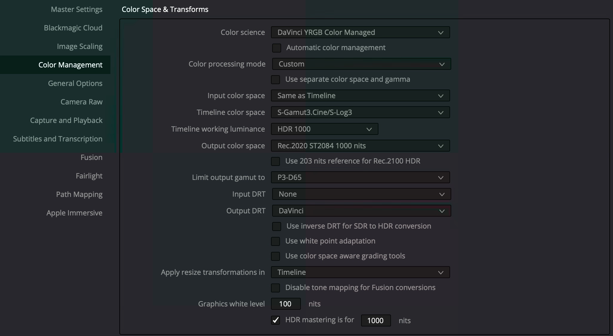
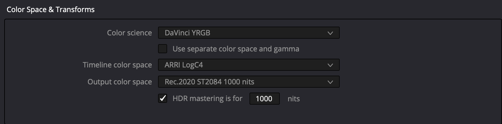
For timeline color space, select the logarithmic color space of the hero camera. In the case of Sony, choose either S-Gamut3.Cine/S-Log3 or S-Gamut3/S-Log3. The DRT settings are completely up to user preference. It is virtually impossible to achieve the look of DRTs with traditional grading tools.
“HDR mastering is for X” lets you specify the output, in nits, to be inserted as metadata into the HDMI stream being output, so that the display you’re connecting to correctly interprets it. Set the “nit” level (cd/m2) to whatever peak luminance level your HDMI connected HDR display is capable of.
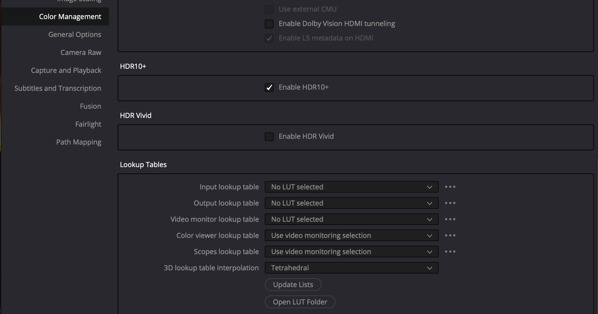
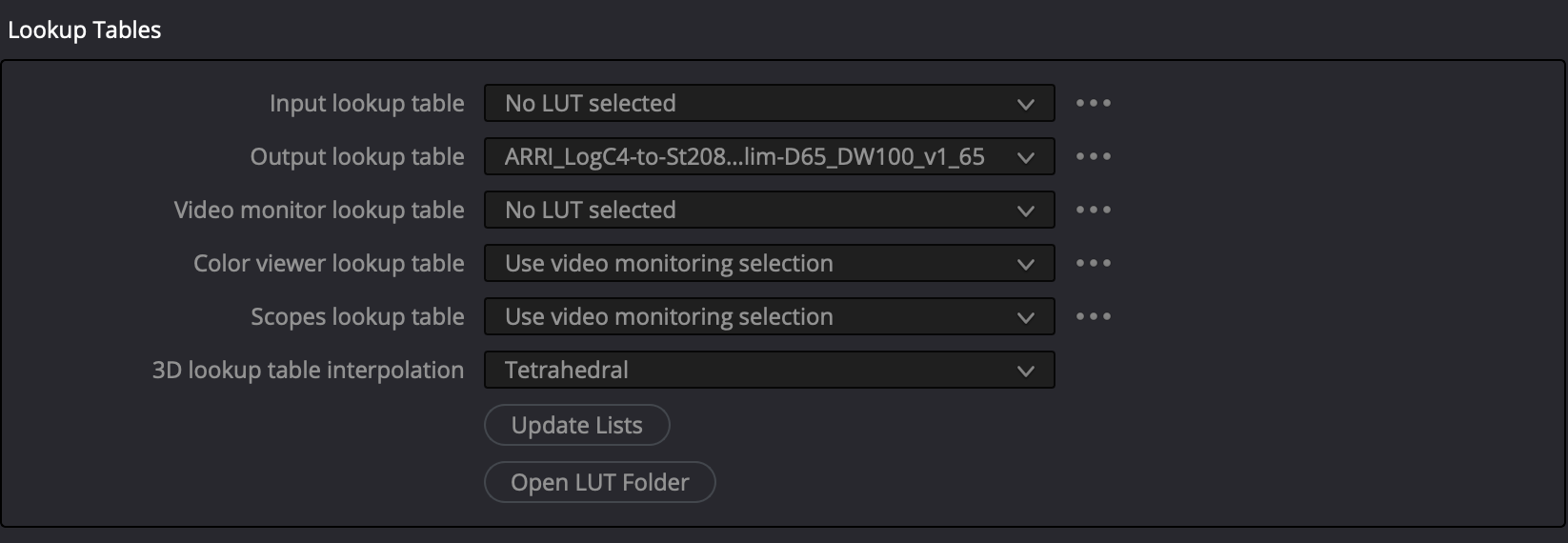
Under Lookup Tables, be sure to select Tetrahedral interpolation, as it outperforms Trilinear.
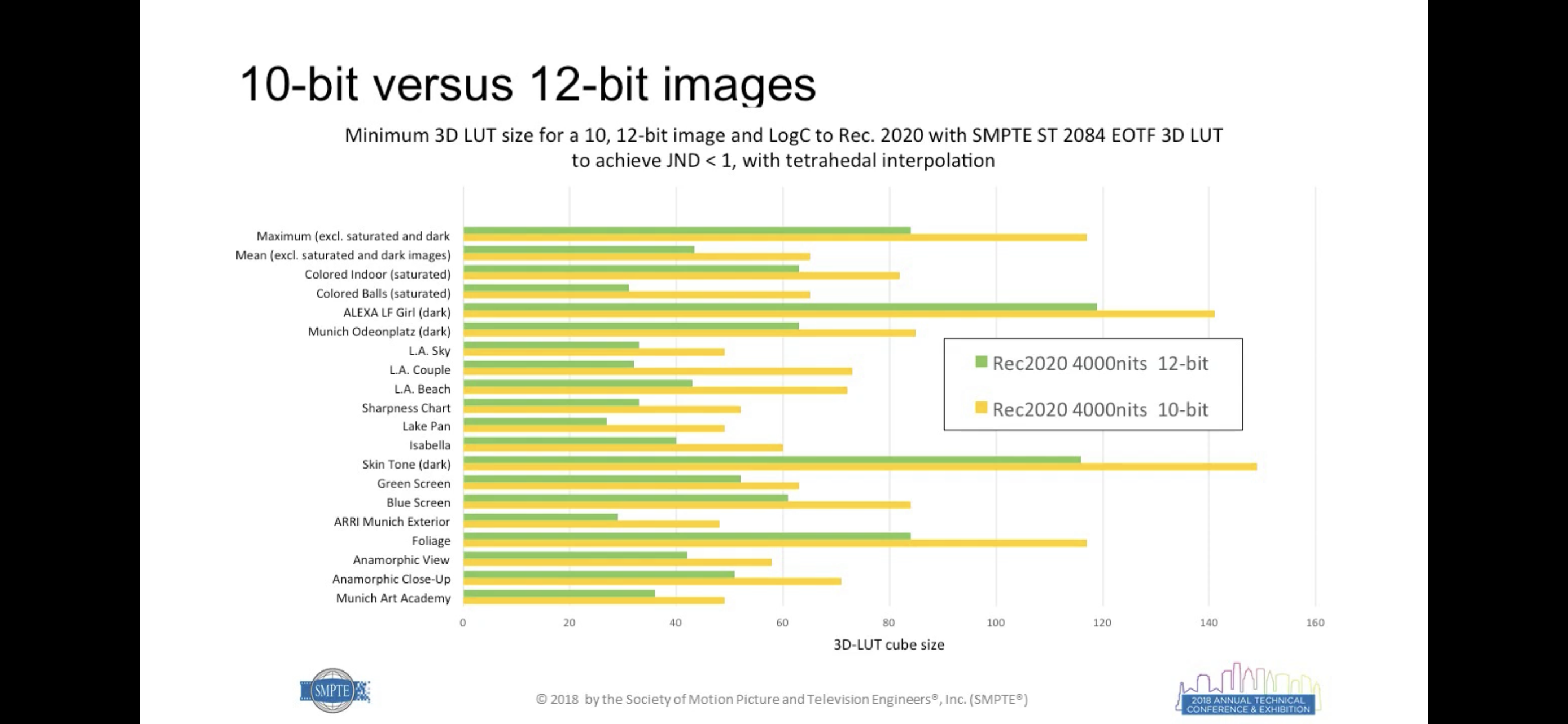
Whenever possible, use 65grid LUTs, because when it comes to HDR WCG, traditional 33 X 33 X 33 LUTs are not large enough to avoid noticeable interpolation errors.

ARRI LogC4 Color Management Settings
Download the ARRI LogC4 LUT Package and ARRI Look Library LogC4 (3D-LUTs). Unzip the files, then place the folders in Resolve lookup tables and update lists. Select ARRI_LogC4-to-St2084_1K_Rec2100-P3lim-D65_DW100_v1_65.cube for the output lookup table.
P3-D65 or BT.2020?
As HDR video becomes increasingly mainstream, the push for wider color gamuts has led to debates over the practicality of using Rec.2020 as a mastering standard. Experts warn that Rec.2020’s wide color gamut is impractical for real-world use. From energy inefficiency and metameric failure to challenges in gamut mapping and a lack of compliant displays, the technical and creative hurdles of Rec.2020 are significant. This article compiles insights from industry professionals on why embracing Rec.2020 may do more harm than good.
“People’s relation to color films is precisely the same as it was in relation to the first Talkies. When sound was first introduced, people were so astonished that they wanted to hear moving pictures talk endlessly like actual people. The upshot of this was that initially there were lots of films filled with songs catering exclusively to this sense of wonderment. It was impossible to attend to aesthetics. When the novelty of talking pictures wore off, people started to understand that sound is not supposed to be deployed for its own sake but must have some aesthetic function… What will popular taste demand next? Those who watch films will expect to see the brightest of clothes, the reddest of cheeks, the most colorful flowers, and all manner of furniture in color films, and they will expect each of these to be the brightest and most garish colors; whether this strengthens the basic visual power of a film and its impact or ruins them will be irrelevant.”
— Muhammad Hasan Askari (1919 – 18 January 1978). Introduced, translated and annotated by Ali Nobil Ahmad)
Samsung Display: Rec.2020 Must Be The New Standard
At the 2023 OLED Korea Conference held in Incheon on April 13, Samsung Display’s Vice President of Strategic Marketing insisted that the display industry must switch From P3 To BT2020, declaring,
“To implement optimal HDR for high-definition content, we need to set a new standard for color in the display industry.” Concerning which, he added that it’s vital to “switch the color gamut standard from the current DCI-P3 to ‘BT2020 (UHD (4K) color specification established by the International Telecommunication Union (ITU))’, and consider the color volume that can represent the same color at any brightness.” “The color luminance of red (R) green (G) blue (B) three primary colors is a more important picture quality characteristic in consumer real-use environments than the luminance measured on the white screen,” he added. – Lee Ki-jong, “The OLED penetration rate of automotive displays is expected to be 30% in 2030”, The Elec (April 13, 2023)
“We don’t actually know what the ones and zeros that we’re putting on the drives are actually telling us”
Yet, commercialized reference grading monitors can’t attain Rec.2020; and consumer devices struggle to even cover industry-standard P3. Patrick Inhofer, CEO, Mixing Light, put the issue front and center,
“We’re in a situation now where the color volumes we’re working at, the nit ranges we’re working at, the brightness values we’re working at, exceed the ability of any modern display to reproduce. When HDR came out, the specifications were designed to exceed our ability to actually see it today, with the knowledge that eventually we will be able to have displays that can fully show us the full color volume at the full brightness range. So we’re working under specifications that exceed our deliverables. And in many cases, all of our work, technically, I think – probably all of the work we’re doing at any level – is somewhat compromised by that. We don’t actually know what the ones and zeros that we’re putting on the drives are actually telling us.” – Patrick Inhofer, “Manipulating Saturation & HDR Graphic White Level – Office Hours LIVE!”, MixingLight YouTube channel (May 30, 2023)
Rec.2020 Never Intended as Native Device Primaries
Meanwhile, industry consultants are not all in agreement that it makes sense to master in Rec.2020.
“The BT.2020 developers appreciated that color processing would be necessary in all consumer devices; their goal was to standardize interchange or container primaries, not native device primaries. Nonetheless, some factions today assert that BT.2020 defines a colorspace suitable for program material—in other words, they argue that program material should be allowed to be mastered to the entire BT.2020 gamut. […] We believe that it is a mistake to create programming that addresses the entire gamut of BT.2020 colorspace. To do so risks compromising color image quality for a wide diversity of display devices, particularly in the cinema, where direct-view LED displays are emergent. We argue that BT.2020 colorspace should be considered an interchange or container space, as its developers intended. We believe that DCI P3 primaries are optimum for production and presentation of programming and for consumer imaging, and we believe that professional (BT.709/BT.1886) and consumer (sRGB) imagery will migrate to P3 primaries..” – David A. LeHoty, Charles Poynton, “Comparing Displays Using Luma Contours and Color Volumes”, Information Display/Vol. 36/Issue 5 (Sept. 19, 2020)
“Rec.2020 is the ITU Recommendation for UHDTV. Included in the Recommendation is the UHDTV container color space, commonly known as “Rec. 2020,” designed to incorporate Pointers Gamut. However, emphasis must be placed on the word “container,” as practical displays cannot implement Rec.2020. Unlike digital cinema, the ITU does not define a minimum UHDTV display gamut to guide manufacturers and artists.” – Michael Karagosian, Color Gamut, Cinepedia
Edit 02.06.2025: It turns out that Dr. Kenichiro Masaoka actually did intend Rec.2020 as a mastering color space after all. We reached out to the ‘father’ of Rec.2020 to settle the controversy, writing:
“There appears to be some controversy whether Rec.2020 was developed as native device primaries that would be used to master program material or if it was conceived of primarily to standardize interchange or container primaries. Your input would be very welcome!”
Dr. Masaoka responded:
“The former is correct. I designed the chromaticity coordinates of the BT.2020 RGB primary set assuming the use of laser light sources (cf. IEEE paper attached), but also considered the possibility of achieving over 90% coverage using quantum dots (cf. Optics Express paper attached), which is now considered an appealing design goal in the market.”
Dr. Masaoka’s email corroborates the papers: Rec.2020 was engineered as a forward-looking mastering space, contingent on emerging emissive technologies (e.g., QDs, lasers). Masaoka anticipated a transition period where displays would gradually approach Rec.2020 – not an indefinite “container-only” phase. This directly refutes claims that it was intended solely as an interchange container. Rec.2020 was explicitly designed as a mastering color space, not merely a container.
No Display Rec.2020 Compliant
“The ITU has ratified the UHD Phase 1 specification, which includes the 2020 color gamut. The specification calls out the red, green and blue primary wavelengths, but it does not give any tolerances. Since these are located on the spectral locus, only laser sources can produce the full color gamut – but with speckle, which is unacceptable. To fix the speckle means the primaries are no longer pure. What’s the result? No display can claim to be “compliant” to the 2020 specification.” – Chris Chinnock, “The Status of Wide Color Gamut UHD-TVs”, White Paper, Insight Media (Jan. 2016)
Rec.2020 Disagreeable
It’s not only industry consultants who are opposed to Rec.2020. Colorists also find colors beyond P3 objectionable.
“To be honest, the full gamut of [BT.]2020, I don’t think we’re ever going to see it. 95% of the Pointer’s gamut, which covers most of the naturally reflected colors in nature – trees, fruits, skin tones and everything – it’s about P3, it’s slightly larger than P3. Those primaries of [BT.]2020 gamut and with tone mapping and 10,000 nit… you don’t achieve that. It’s unachievable. A green laser: are we gonna really talk about the artistic intent of a green laser in the background in some fireworks or something like this? I don’t think so. […] I would consider to all this paranoia of “No, we want the [BT.]2020, we want to do it fully,” and so on – no you don’t. What you need to do is as good as you can, at least P3. Go in a little bit of the boundaries of P3-D65, that’s totally fine. But that’s what you really want to do, because that’s what the people getting at home in the best cases, that’s what a consumer TV can do. Even the 30K monitors that we have, they don’t do all the [BT.]2020, it’s impossible. I have a projector here in the cinema that does the green primary of [BT.]2020 and you cannot imagine how fluorescent that is. It’s just unreal.” – Pablo Garcia Soriano, “The Future of Live HDR Production: A Talk with 6 Broadcast Industry Experts”, Leader Electronics YouTube Channel (May 18, 2021)
When asked why DCI, a consortium of major motion picture studios, specified P3 primaries rather than BT2020 in their DCI High Dynamic Range D-Cinema Addendum, they replied:
“DCI had to weigh the creative value of BT.2020. We’ve worked closely with colorists in attempts to demonstrate the value of colors outside of DCI-P3, and those attempts have been far from compelling. In general, colorists prefer to reduce color saturation. This isn’t entirely without exception, of course, as there have been some notable examples of studios utilizing color values far outside of DCI-P3 but they’re extremely limited. For example, Pixar, in a single shot in the movie “Inside Out”, notably opted for a green value well outside of DCI-P3 to depict broccoli. Nonetheless it’s been difficult to make a compelling case for the real creative value there. So, given all the challenges to achieve 100% BT.2020, the lack of any standard that describes a realistic subset of BT.2020, and the doubtful creative value, DCI opted to retain DCI-P3 as the color gamut for the D-Cinema HDR specification/standard.” – Venue, “DCI (Digital Cinema Initiatives) D-Cinema HDR”, AVSForum (Jan. 24, 2023)
Poor Performance of Rec.2020 Gamut Mapping
Content mastered in Rec.2020 must be gamut mapped for consumer displays that don’t support such a wide gamut, which can have serious consequences in terms of image quality. In their paper Color-gamut mapping in the non-uniform CIE-1931 space with perceptual hue fidelity constraints for SMPTE ST.2094-40 standard, Chang Su, Li Tao and Yeong Taeg Kim argue that, while conventional gamut mapping techniques work well enough for projects constrained to the P3 gamut, those mastered in Rec.2020 can exhibit serious artifacts, “including detail loss, hue distortions, even high visual impacts such as banding, alien color spots, etc., thus seriously degrading the final visual quality.”
Metamerism

“Various studies pointed out that narrow-band primary displays would increase the possibility of metameric failures, and it can be a severe issue in color critical applications, for example, color grading. As HDR displays are ultimately expected to cover the full extent of Rec.2020 color gamut, it is inevitable for such displays to use extremely spectrally narrow light sources or color filters and/or adding more primaries. Therefore, it is not surprising that OM is regarded as a potential issue of HDR displays.” – Yongmin Park, Michael J. Murdoch, “Effect of color gamut and luminance on observer metamerism in HDR displays”, 28th Color Imaging Conference (November 2020)
“[D]isplay systems with narrow-band primaries have significantly greater potential for observer metamarism. Thus, despite their potential for other benefits, display manufacturers might want to consider forgoing the use of narrow-band primaries for displays in color-critical applications.” – Mark D. Fairchild and David R. Wyble, “Mean Observer Metamerism and the Selection of Display Primaries”. Rochester Institute of Technology, Munsell Color Science Laboratory, Rochester, NY/USA (Jan. 2007)
“Human vision has developed to work with the broadband power spectrum of white light from the sun, so viewing narrow primaries can cause color perception errors (or variation) when viewing sources with the finely tuned power spectrums from systems designed to approach Rec. 2020.” – Bob Raikes, “Conference Features Advances in WCG, HDR, and 3D”, Display Week 2021, Information Display (Oct. 2021)
Resource Hungry
Italian tech website DDay.it contributor Paolo Centofanti attended a presentation by TCL Europe in Warsaw in November 2023 where the manufacturer showcased their newest lineup of 85″ and 98″ miniLED TVs, which are claimed to cover as much as 90% of the BT.2020 color space. Interestingly, TCL doesn’t consider 100% BT.2020 all-important, at least not for the time being. Centofanti wrote,
“The Rec.2020 gamut race, which, like the one for the 8K, TCL does not consider a priority at the moment, basically for the same reasons: lack of content that makes wide use of it, difficulties for consumers to perceive its benefits, substantial impact on energy performance. With RGB OLED and Micro LED things might change, but it will still take some time.” – Paolo Centofanti, “We saw the 5000 nit TCL mini LED TV and we were dazzled”, DDay.it, (Nov. 29, 2023)

Concerning the impact BT.2020 has on energy consumption, Dr. Michael Hack, VP, Business Development, Universal Display presented a paper at Display Week 2021, where the authors calculated the change in power consumption of a display going from sRGB to DCI-P3 to BT.2020. In the study, the simulated OLED display consumed ~2300 mW for sRGB, ~2450 mW for DCIP3 and ~3000mW for BT2020, while the power consumption of an LCD was even greater.
Timeline Color Space: Resolve Color Management Or ACES?

When it comes to post-processing, using the fewest number of transforms and working at the highest available bit depth in a native color space greater than the display color space are key to preserving the greatest image quality. So, should you be changing your timeline color space to DaVinci Wide Gamut Intermediate or not?
What selecting RCM/DWG or the ACES framework is not going to do is magically improve image quality, reveal colors that weren’t already captured at the outset, or make the picture any more cinematic looking. That being the case, why would anyone choose, say, DaVinci Wide Gamut rather than REDWideGamutRGB/Log3G10 for their timeline color space?
If you’re a professional colorist handling footage from a number of different cameras on the same timeline with deliverables targeting everything from social media and streaming networks to broadcast and theatrical release, mapping everything into a unified color space makes perfect sense. It elegantly solves the problem of mismatched color spaces, simplifies VFX round-tripping, enables using the same LUTs across all shots and ensures that NLE controls behave consistently across all of the clips on the timeline.
However, it’s essential to understand that these unified spaces aren’t neutral arbiters of image data; they’re designed with specific philosophical goals.
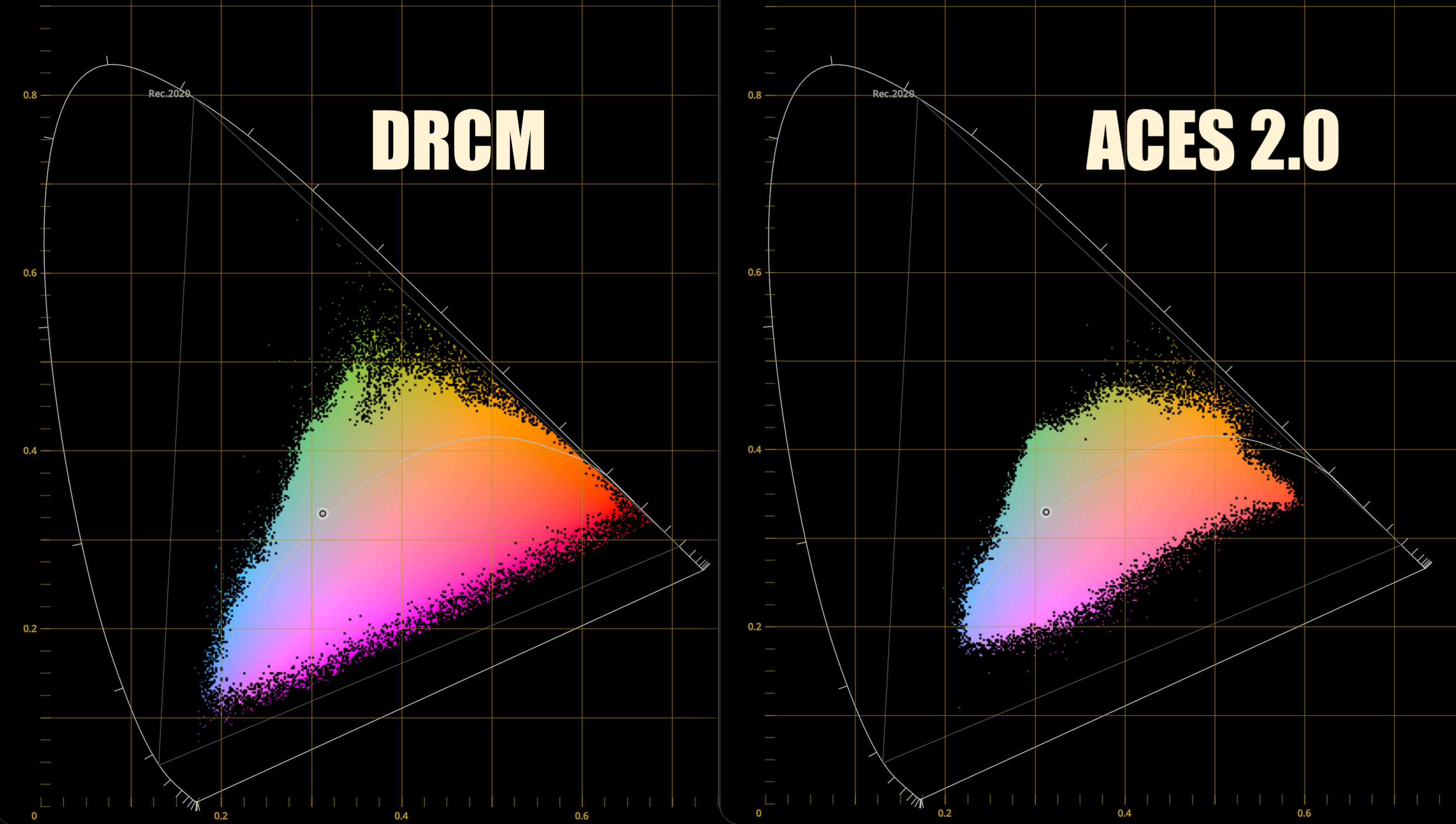
Graphics programmer Filippo Tarpini observed that ACES 2.0, in its default state, “is fully focused on maintaining a contiguous and conservative look between SDR and HDR.” He noted that in testing, “Highlights completely desaturate to the point where they never have any color. That’s simply not how our eyes work, and it looks off. Most importantly, it doesn’t take much advantage of the wider gamut of HDR displays.”
Rendering engineer Jean-Michel Gilbert confirmed that this is not a bug, but a feature: “Yes it’s by design. There were a lot of arguments in the ACES next meetings about whether SDR or HDR should be the master target and the SDR champions won.”
For an HDR colorist, the implications are profound. It means that if you adopt ACES 2.0 as your color management framework and use its default Output Transform, you’re baking in a set of choices designed to restrain the HDR image to ensure it doesn’t deviate too far from its SDR counterpart. As Gilbert bluntly predicted, the result of this industry-wide standardization may be that “a lot of movies will have worse HDR in the coming years compared to previous years,” a sentiment Tarpini echoed, suggesting “we are in for some further years of bad HDR!”
The Hero Color Space
“Unless you’re doing a documentary or a show that has way too many cameras you have a hero camera: can be an Alexa, can be a Sony, can be a Red, a Blackmagic, a Canon, you name it. You have a hero camera, and usually you have a hero logarithmic color space. So the idea is that that is the color space that I use for all the color corrections. If a shot belonged to a different camera then I do a color space transform to bring that specific shot to the logarithmic.”
– Walter Volpatto
So, if you’re dealing with a single-camera project, simply choosing the camera’s own native color space for the timeline and adding an output transform to the display color space as the very last operation is entirely adequate, avoiding unnecessary complexity and image manipulations that could even degrade the image. If anything other than the log of the hero camera is going to be your working color space, it’s essential that you’re taking that into account on set with an appropriate viewing LUT, as it could very well change how you end up lighting your scenes. Do note that if you want to use any of Cullen Kelly’s LUTs, you’ve got no choice but to select either DaVinci Wide Gamut Intermediate or ACES as the color management framework.
Full ACES
- Your production used ACES on set, in VFX, Digital Intermediate and final Mastering
- Your production used ACES Input Transforms, Academy-published ACES Output Transforms, and delivered master digital image files conforming to Society of Motion Picture and Television Engineers (SMPTE) standard ST 2065-4
— Academy of Motion Picture Arts and Sciences, “Information on ACES and How to Determine if It Was Used on Your Production”
Because ACES is perceived as a high-end industry standard, it’s often used as a marketing buzzword-even when actual color management follows traditional methods. A full ACES pipeline requires using Academy-specified input and output transforms across all stages, from on-set monitoring through VFX, DI, and final mastering. More commonly, productions adopt ACES only partially: for final mastering but not on set, or in post but not during VFX work.
DP Jamie Cairney on Sex Education Season 2:
“It doesn’t change anything. For me, it hasn’t changed anything in terms of how I work on set… We were monitoring in Rec.709 on set. In terms of monitoring with ACES on set at that time, we felt that that was a bridge too far… I monitor in Rec.709 and that’s it.”
Jamie Cairney, BSC, from “Sex Education Season 2 – A Deep Dive Into The End-To-End ACES Workflow”, Academy ACES YouTube channel (Mar. 31, 2021)
Rand Thompson wrote about the hazards of not incorporating ACES from the outset when the project is to be finished in ACES, using RED IPP2 as an example:
“You could include a Creative RWG/LOG3G10 LUT along with whatever Chosen IPP2 Output Transform you wanted and shoot with that. Then a DIT would probably make CDL corrections that were according to the DP or Director and pass those CDLs along to the Colorist to add to the Post Production Grade for further color grading… Now, however, you would be starting from a Look with different Tonality and Color Rendition that neither the DP, Director and DIT had started out with or agreed to in Production nor what the DIT had made CDL correction for. So now it’s up to the Colorist to make it resemble the look that was established in Production which will be very hard if not impossible to achieve.”
The Scopes

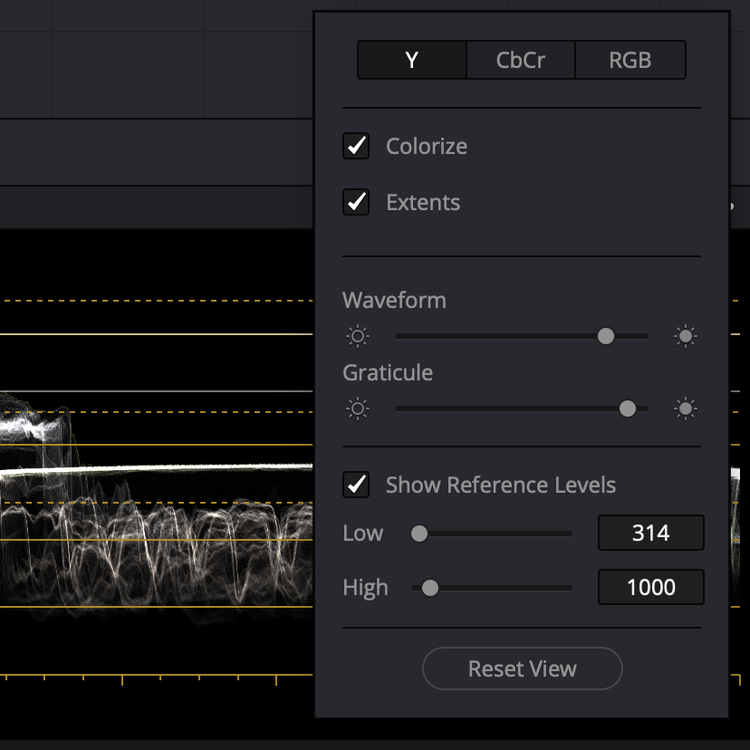
Be sure to enable extents to see the maximum overshoots and undershoots in your scopes.
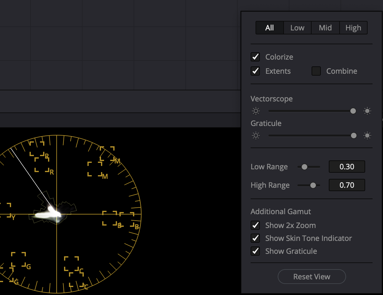
Check ‘Show Skin Tone Indicator’.
Enable ‘Display Qualifier Focus’.
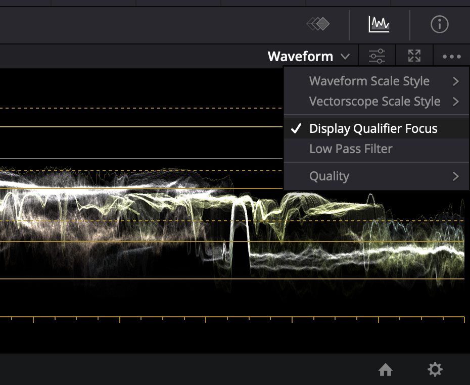
In earlier versions of DaVinci Resolve, to prevent power windows from appearing on an external monitor, we went to View > Window Outline and checked Only UI. That option has been moved to within the three dots menu in the Color page viewer as shown in the screen grab below.

Set Up LG OLED For RGB 4:4:4
DaVinci Resolve and Dolby Vision certified trainers have always insisted on Full data levels for HDR video monitoring and delivery, but in fact, either Full or Legal range may be used. The original Dolby Vision workflow recommendation of full range was solely because their eCMU could only handle SDI signals in the full range format. HDR distribution is done at 10 bits to the consumer and 64-940 range, not 0-1023. Whichever you choose, when exporting, be sure to leave data levels set to Auto. From Dolby Professional:
- Video monitoring via iCMU can happen in Full or Legal range
- Ensure that the input of your reference display matches to the video output of the color corrector (Full-Full or Legal-Legal)
- Using the eCMU requires a Full range video output from the color corrector
- Use the default data level setting (auto) when exporting your video
- There’s no need to change the Dolby Vision metadata for ProRes exports
If you’re delivering Full range, the display must also be set to Full range. Here’s how to set up your LG CX.
Double-check to confirm that you’ve disabled motion eye care, sharpening, TruMotion and other enhancements.
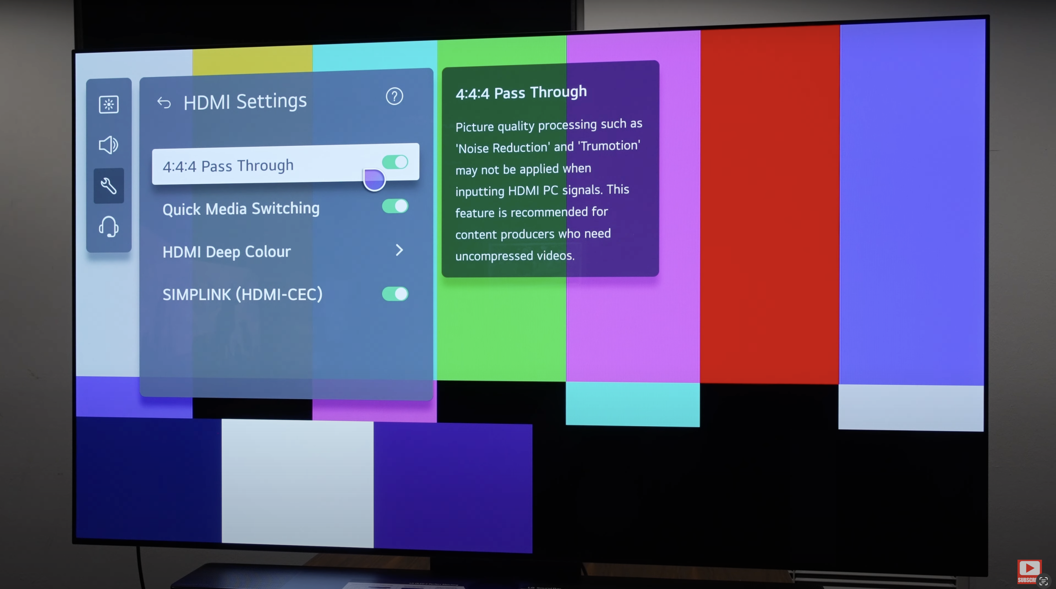


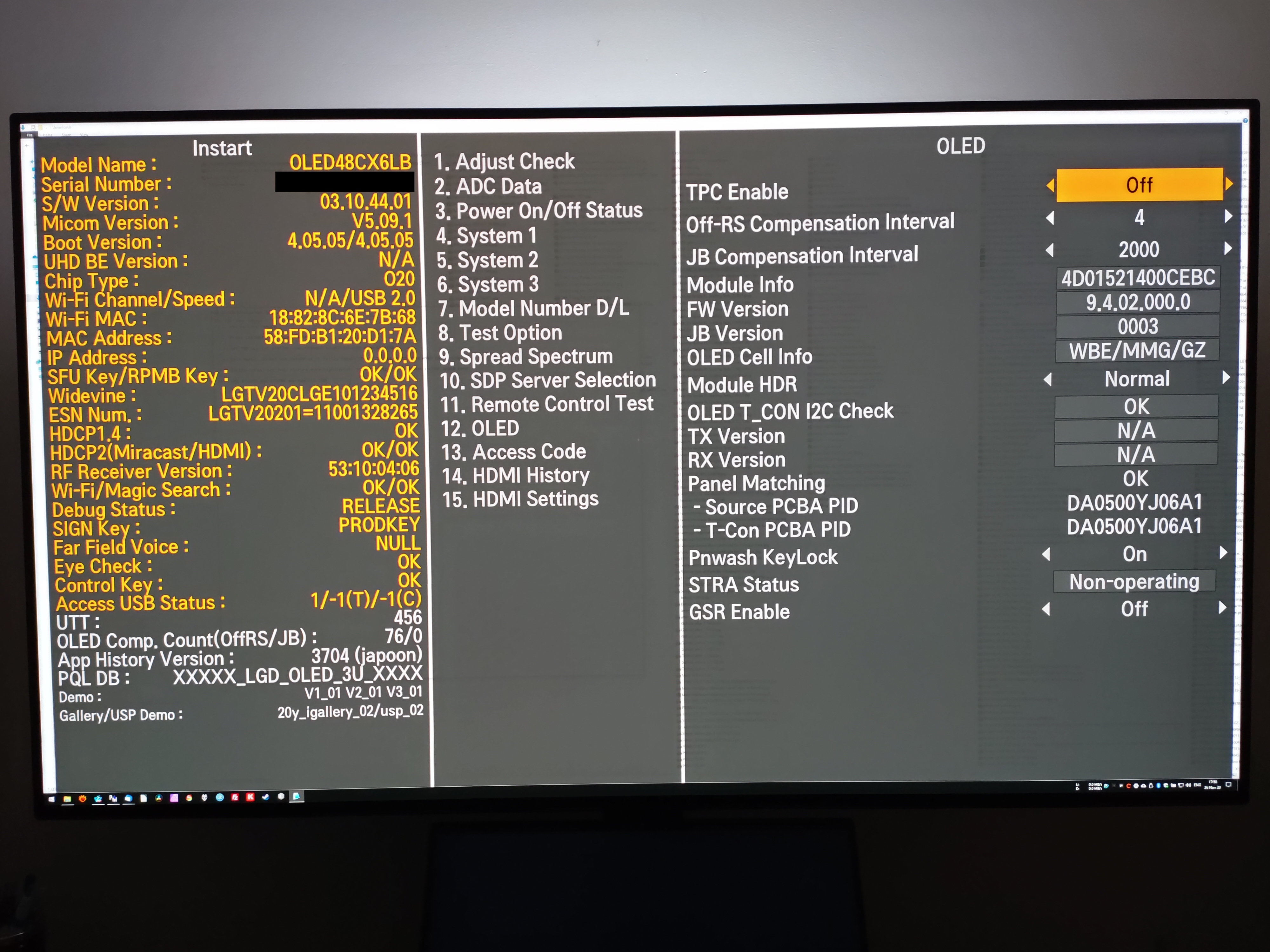
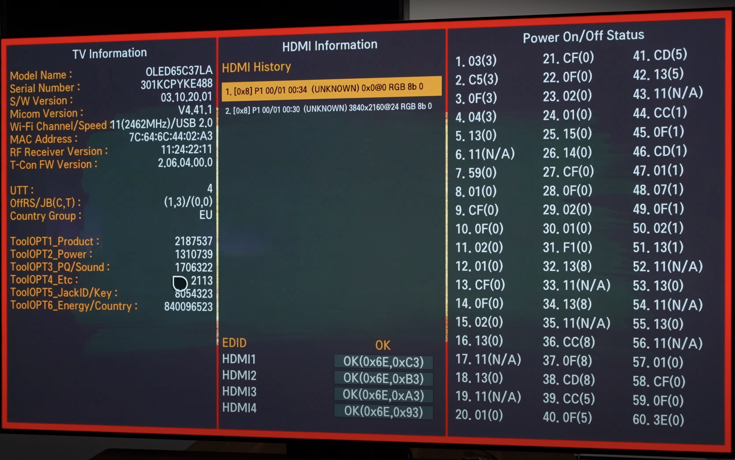
Update: Instructions for disabling TPC and GSR on the LG C3 and G3 can be found here. We assume no liability if you brick your TV or void your warranty.
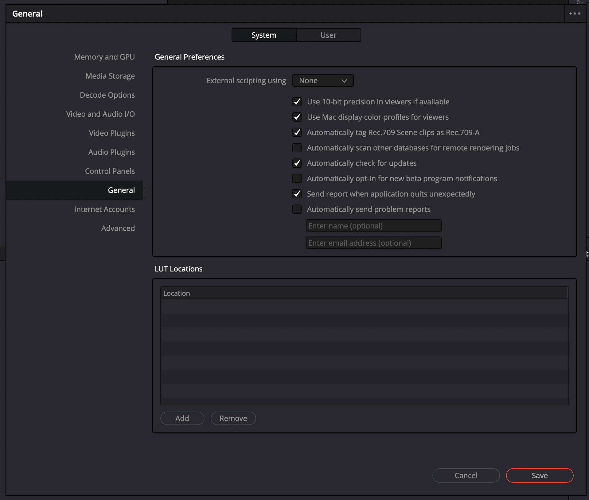
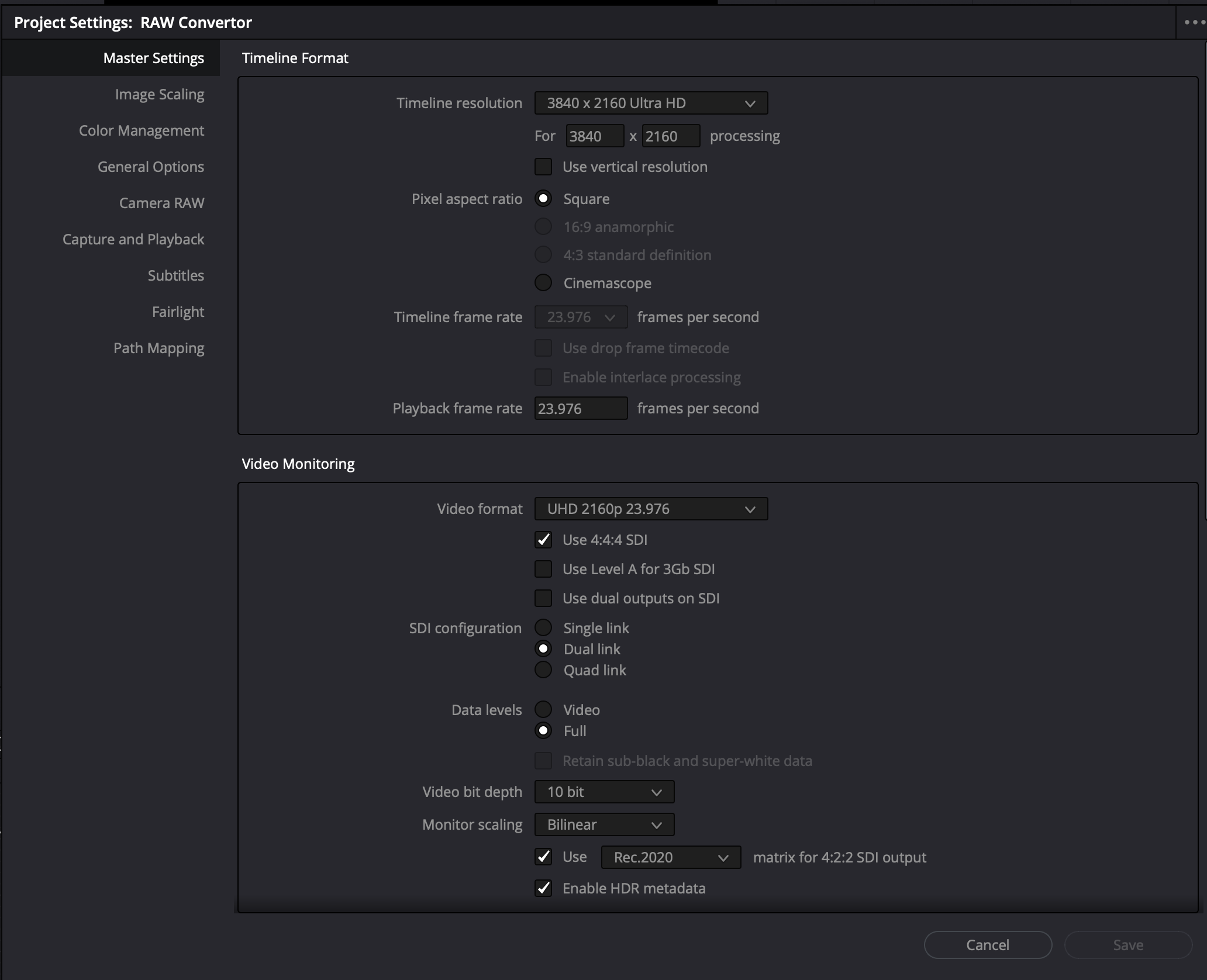
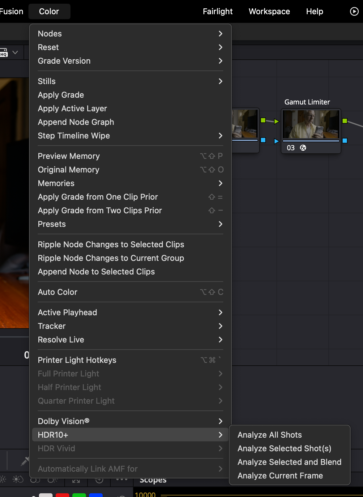
Generate MaxCLL and MaxFALL HDR10 Metadata in DaVinci Resolve
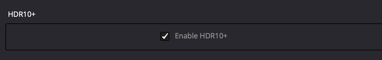
As consumer HDR displays have differing peak luminance and contrast capabilities that are not infrequently less than the mastering display, it’s necessary to map PQ content to match the capabilities of the target consumer display device. This scaling or mapping is controlled and managed by metadata. DaVinci Resolve is able to generate this metadata for us. After you’ve finished grading your video, you can go ahead and add MaxCLL and MaxFALL HDR10 metadata. MaxFALL expresses the value in nits, for the frame in your project with the highest average brightness level, while MaxCLL is the value, expressed in nits, of the brightest pixel component in the project. In Project Settings on the Color Management page, be sure that HDR10+ is enabled.
Note: “When the content peak is within the display peak, tone mapping is unnecessary because there’s no brighter pixel than the display’s capability.” – Bong-gil Bak, Principal Engineer, Samsung Electronics (2021)
The HDR10+ Whitepaper confirms this:
“Tone mapping happens when the source content peak luminance is higher than the display device peak luminance.” HDR10+ System Whitepaper (September 4, 2019) HDR10+ Technologies, LLC
This technical reality—that tone mapping is only needed when displays fall short—is increasingly relevant as consumer displays improve. Steve Shaw of Light Illusion puts it plainly:
“Metadata is really needed only for one reason – when HDR was introduced there were no TVs that could match the peak luma and gamut coverage of the mastering/grading displays – specifically peak luma. […] However, many home TVs are now getting close to matching the grading display’s peak luma and gamut capabilities, especially as most HDR masters are graded on displays with between 1000 and 2000 nits, making the requirement for metadata an interesting question going forward. If the viewing TV can match the grading display why is there a need for metadata? The answer is, there isn’t…” – Steve Shaw, CEO Light Illusion, What Is HDR?
Project render settings

The Top-Down Approach
Step #1 in HDR grading is defining the project’s ‘speed limit’ and highlight roll-off. Highlights dictate perceptual hierarchy. Shadows are subordinate. SDR-centric grading cripples HDR’s DNA. Start at the top.
1. What does setting a speed limit mean?
Setting a speed limit means defining your target peak brightness (in nits) and highlight roll-off philosophy early on.
2. Why Is Setting A Speed Limit Early On Crucial?
Establishing peak highlight levels early on ensures that brightness serves the story, not the technology.
3. Why do highlights dictate perceptual hierarchy?
Highlights impact the perceptual contrast and tonality of the entire image.
4. Why are shadows subordinate?
Highlights actively limit what we can see in the shadows, not the other way around. The brightest element in a scene sets a “visibility floor” for the darkest shadows.
5. What is SDR-centric grading?
SDR-centric grading refers to the workflow order: first, a full creative grade is established for the SDR version of the content, and then the HDR version is created from that SDR master. It is a ‘bottom-up’ approach.
6. How does SDR-centric grading harm HDR?
SDR-centric grading undercuts one of HDR’s core strengths—preserving relative spatial information that SDR compresses.
Sky UK’s Technical Specification for Delivery of Content Appendix 4: HDR Grading Guidance warns against a bottom-up approach: “To avoid an overly reserved approach… the initial grade should be completed on the HDR version, with the SDR grade being completed afterwards.”
7. What does ‘start at the top’ mean?
Starting at the top means the HDR grade is done first. This is the prevailing industry standard ‘top-down’ approach. An SDR version is then derived from the HDR master.
The Industry Standard Versus A Problematic Alternative
The ‘top-down’ approach is recommended because it makes HDR the primary creative canvas. In contrast, some advocate for a bottom-up approach—a process Cullen Kelly refers to as “lifting the veil”.
Cullen Kelly’s “Lift the Veil” Method
“I like to… start with a standard dynamic range rendering of an image within an HDR container and then to slowly lift the veil… and allow my client to say ‘Oh! I like that,’ or… ‘Wow! That feels like nothing I’ve ever seen before.’” – Cullen Kelly, “Clients love how I use the Creative Potential of HDR” (Colorist Society, Mar. 3, 2025)
Why This Is Suboptimal
Starting with an SDR image inside an HDR container and “lifting the veil” by incrementally increasing the peak luminance is not a widely recognized industry standard workflow for professional HDR color grading. It undermines HDR’s potential, resulting in the “overly reserved” HDR that specifications like Sky UK’s caution against.
For optimal results, the industry recommended practice is unequivocal:
Do I grade HDR first? SDR first? Or do both at the same time?
The HDR should be graded first, followed by a Dolby Vision analysis of the HDR image and a shot-by-shot trim pass of the entire program. It is our experience that – generally speaking – you will get the best results out of both the HDR and the SDR grade if you grade the HDR version first and approach that as the ‘hero grade’. – Netflix. FAQs. “Dolby Vision HDR Mastering Guidelines”
Is Shadow Detail Really HDR’s Greatest Advantage?

High Dynamic Range (HDR) has been praised by filmmakers for its shadow detail, but is that truly HDR’s crowning achievement? In this collection of thoughts from colorists, consultants, cinematographers, researchers, industry organizations, studios and manufacturers, we explore whether this obsession with “seeing into the shadows” overlooks HDR’s real potential.
The “Shadows” Camp
The visual benefit of HDR is mainly “about increased shadow detail.” Joshua Pines, Color Scientist, Picture Shop, in etcentric (Feb. 2016)
“HDR is about shadows and all the nuances we can now play with thanks to the extra bits available. I don’t understand why there is so much interest in brightness that it can be about special effects at most.” Mike Chiado, CTO, Company3, in DDay.it (Jan. 2024)
“Everyone likes to talk about the bright whites in HDR, but I think perhaps the added range in the shadows is more interesting and more important than added range in the highlights.” Erik Messerschmidt, DP, in American Cinematographer (Dec. 2019)
The “Highlights” Camp
“While there are several key quality dimensions and creative opportunities opened up by HDR, one of the key differentiators from SDR is the ability for more accurate rendering of highlights.” ITU-R BT.2390
“HDR’s consumer appeal is based upon image elements that are considerably brighter than the portrayal of diffuse white, having as much as three or five times higher luminance.” David A. LeHoty, Charles Poynton, Comparing Displays Using Luma Contours and Color Volumes, Information Display, Vol. 36, Issue 5 (Sept. 2020)
What makes a night-time image, or any picture in which dark regions predominate, an HDR image rather than merely a dark SDR image, is that there are also very bright pixels. Van Der Vleuten Renatus Josephus, Nijland Rutger, Tichelaar Johannes Yzebrand. Philips, Multi-Range HDR Video Coding (Nov.2020)
“Peak Luminance is one of the first specifications to consider when choosing a display as it’s one of the main components that describe HDR imagery.” Dolby Professional, HDR Display Considerations (Jan. 2025)
“One essential part of HDR is to render highlights, such as specular reflections, in images above the diffuse white level.” Kenichiro Masaoka, Gamut Rings Color Scope, Information Display, Vol. 40, Issue 1 (Jan. 2024)
“Formally, one can define the luminance dynamic range as the span of all luminances from a minimum black (MB) to a peak white or peak brightness (PB), ergo, in principle one might have HDR movies with very deep blacks. Pragmatically one may define, and handle, e.g. color process, the HDR images mainly on the basis of a sole value, namely being a higher peak brightness (usually this is what users are most interested in, whether it be bright explosions or merely the more realistic specular reflection spots on metals and jewels and the like, and one may pragmatically state the minimum black to be the same for the SDR image and an HDR image).” Nijland Rutger, Improved HDR Color Processing for Saturated Colors, Philips (Jan. 2021) [boldface type added]
“While HDR includes increasing the range at the dark end as well as the bright end, one of the unique attributes of HDR is more accurate rendering of highlights than traditional video. Such highlights include both specular reflections as well as emissive objects (visible light sources) and can require very high maximum luminance.” Scott Daly. Allison, R., Brunnström, K., Chandler, D., Colett, H., Corriveau, P. et al. Perspectives on the definition of visually lossless quality for mobile and large format displays. Journal of Electronic Imaging (2018) [boldface type added]
Full Range of Shadows & Highlights
“A High Dynamic Range System (HDR System) is specified and designed for capturing, processing, and reproducing a scene, conveying the full range of perceptible shadow and highlight detail, with sufficient precision and acceptable artifacts, including sufficient separation of diffuse white and specular highlights.” SMPTE
Obliterating the Shadow Myth
“The reality is PQ based HDR does nothing for black levels, and that is true of shadow detail too – no matter what those less knowledgeable or marketing material may say. A good example of inaccurate information used to promote ‘benefits’ of HDR can be seen in this presentation on YouTube, where improved shadow detail was stated as being an example of the benefits HDR brings over SDR… which is incorrect. The reality is the SDR image is probably just poorly graded, even potentially deliberately so, to promote HDR. HDR provides no such benefit over SDR shadow detail. And in reality, due to the EOTF curve in use on PQ-based HDR, the black under normal home viewing conditions will often be ‘crushed’ when compared to SDR versions of the same image. This is born [sic] out by the surround illumination level that is specified as being preferred for HDR as being 5 nits, while for SDR it was originally specified as 10% of the maximum brightness of the display. That large discrepancy, and shows that HDR black/shadows will often be washed-out/clipped when viewed in any environment where the ambient light levels cannot be controlled. In reality, a 10-bit SDR image will have potentially better black/shadow detail than a PQ based HDR image.” Steve Shaw, CEO, Light Illusion

At 1:41:00 of “Debunking HDR”, Steve Yedlin performs a live execution of the industry’s shadow fetish, obliterating the myth that shadow detail is HDR’s primary advantage:
“I’m going to make a change here. See that change? I can see it. I’m not saying it’s not there. It’s kind of subtle, right? It’s getting a little milky. So, based on that definition that they’ve got going there, that is a one thousandfold change in the contrast of this shot. [snickering in the audience]. Because the white is staying the same and the black is going from .0001 to .1. We see why that’s absurd.” – Steve Yedlin

“The black luminance level between about 0.003 and 0.1 cd/m2 does not significantly affect image quality. [When] the black level is 0.1 or higher, the preference of the image decreases. The best performance is achieved when the black level is 0.003, but there is no big difference from 0.1 cd/m2.” Ye Seul Baek, Youngshin Kwak, Sehyeok Park, Effects of Black Luminance Level On Image Quality, Society for Imaging Science and Technology (2019). [boldface type added] The test used a 65″ 3840×2160 OLED TV.

Researchers defined a model able to predict the maximum visible dynamic range for any given scene based on glare and local adaptation. The results showed that, while there is a non-negligible loss of visibility in brighter parts due to local adaptation, the greatest decrease in perceived dynamic range compared to the physical DR occurs in darker scene regions due to glare. For some scenes, the physical and the visible dynamic range are nearly identical, while for other scenes the visible dynamic range is half that of the physical range. Vangorp et. al. A Model of Local Adaptation (Nov. 2015) [boldface type added]
“People can typically only see detail in scenes that vary by 1:104 at any given adaptation level, as described by Banterle and others. This means that in a scene with a maximum luminance of 1000 cd/m2, the human eye would only be able to simultaneously observe a minimum luminance of 0.1 cd/m2.” “Hybrid Log-Gamma and Displayed Light”, BBC Research & Development (Jan. 2026)
The Practical Viewing Environment Problem
“Whilst grading suites provided precisely controlled equipment and viewing environments, the same is not true for most home viewing. Low luminance images where the subject and relevant surroundings cannot be clearly distinguished cause frustration and complaints from viewers.”
“Content should be suitable for viewing in ordinary home viewing environments, where controlled, low lighting cannot be guaranteed, and display technology will vary. Particular care must be given to shadow details, with consideration to what is inconsequential image information and what needs to be preserved through re-encodes and consumer TV presentation.”
“Note that nuanced shadow detail can be lost through encoding and consumer TVs often emphasise objectionable banding artefacts in shadow detail, which can be more apparent where midtone information is scarce.” Technical Specifications for the Delivery of Content to Sky UK (Mar. 2023)

“Let’s talk about black levels. A typical HDR monitor has a black level of 0.1 nits. A high-end HDR monitor can go to 0.01 nits. So let’s say you get 0.05 nits black and 1,000 nits peak luminance: 14 stops. Mid-range HDR: 0.1 nits black, 500 nits peak, 12 stops. The natural conclusion is it’s not bad. Well, this is the ugly shadow problem. Ambient light decides how much you see into shadows. Rec. 2100 defines peak luminance 1,000 nits or greater; black level 0.005 nits or less: 17.5 stops. Most HDR is geared towards shadows. The increase from Rec. 709 highlights is only three stops. The remaining advantage, over 7.5 stops, is shadows. Rec. 2100 specifies surrounding light should be 5 nits to see shadow details. The only way is a completely dark environment. A lamp or window light delivers 50 lux, equivalent to 15 nits. A monitor 10 feet away from a white wall gets back bounced light. An HDR TV outputting 1,000 nits gives 40 lux; 500 nits gives 20 lux. Both exceed Rec. 2100’s 16 lux limit and Netflix’s 10 lux. You’ll obliterate shadow detail. Assume 50 lux: 15 nits. The difference from 0.005 nits to 15 nits is 8 stops. Whatever 7.5 advantage in shadows, you won’t see compared to a normal monitor.” Sareesh Sudhakaran, Founder, Wolfcrow Studios, “What is HDR and is HDR worth it? You’re welcome.” YouTube (2017)
The Consumer Verdict: Highlights Drive Preference

Even in a Dolby Cinema with a claimed 0.0001 theater black level, moviegoers never benefit from it, because of the auditorium’s light pollution, including exit signs and reflections off the audience from bright imagery. If we glance at Dolby’s notorious graph from their study of viewer preferences for highlights and shadows, we see that SDR’s modest .1 nits already satisfied a whopping 50% of participants, whereas somewhere in the neighborhood of 2,400 nits, or 24 times the peak luminance of traditional SDR displays, were required to satisfy 90% of all viewers (for diffuse white!), which indicates that highlights are, as Charles Poynton has pointed out, HDR’s chief appeal to consumers. 1,000 nits only satisfied a paltry 20% of those taking part in the study. In other words, HDR content does not necessarily need to be mastered to .0005 nits in order to be perceived as being of sufficiently differentiable higher quality than SDR, but luminance levels appreciably greater than diffuse white are absolutely necessary. Lastly, shows with prolonged dark scenes will cause all flagship OLED TVs in 2024 to dim down over time, ruining picture quality.
HDR in Practice: Separating Technical Reality from Cinematic Mythology
Persistent misconceptions about High Dynamic Range imaging—from exposure dogma to creative workflows—continue to undermine its potential. This critique dismantles a dozen pervasive fallacies using empirical research and industry evidence. Practically each myth violates fundamental vision science, a theme that will be developed further in our upcoming HDR Creator’s Companion. 🎉
I. Production Misconceptions
High Dynamic Range means capturing ‘x’ number of stops of DR on set
Reality: It’s not about counting stops; it’s about spatial contrast. Our eyes don’t see pixels; they see relationships.
Relying on production monitor to spot highlight clipping
Only trust proper exposure tools. Waveform monitor illiteracy is a real thing. See: “A Case for Graph Literacy”.
Expose for middle gray, let the rest roll off
Reality: Exposing for middle gray all but guarantees highlight clipping. Highlights should always be protected. Clipping highlights destroys spatial contrast. Visit: HDR: The Number One Rule to pay your respects to the casualties of exposing for middle gray.
Lighting & Exposure Irrelevant
Quote:
“There is no such thing as proper exposure, there is no such thing as proper lighting.” – Erik Messerschmidt, ASC
Reality: Messerschmidt’s statement contradicts the entire foundation of cinematography. Rejecting “proper exposure” rejects cinematography itself.
HDR = SDR + brighter highlights
Reality: Treating highlights as merely a “ceiling” underutilizes HDR as a creative medium.
Excessive diffusion or halation
Reconsider diffusion: mist/filters artificially blur highlights, destroying precise luminance relationships – HDR’s core strength.
HDR clipping = SDR clipping
Quote:
“Clipped highlights are a creative choice. They always have been. There are numerous examples throughout cinema.” – Erik Messerschmidt, ASC
Reality: It is a near-universal principle that HDR highlight clipping is unsightly, adds burden in post-production, increases costs and ought to be avoided. (see above)
“Headshots” Doctrine
Quote:
“Hitting people in the head with a tremendous amount of light is an unappreciated advantage of HDR” – Erik Messerschmidt, ASC
Reality: Retinal assault = viewer discomfort.
Avoid Bright Windows
Quote:
“I would advise not placing actors in front of windows as the extra brightness might make the actor appear less visible.”- Asa Shoul, Sr. Colorist
Reality: During his anti-HDR rant earlier this year, cinematographer Steve Yedlin remarked how raising the brightness of a window made the talent’s features less visible. His window-brightness demo proved HDR’s strength: real-world contrast ratios. Yet he framed it as a flaw!
Critiquing low contrast and highlight clipping is a matter of personal taste
Quote:
“Confusing your personal taste with a technical standard lowers your credibility as a commentator.” – Erik Messerschmidt, ASC
Reality: Flat video undermines one of HDR’s chief advantages- spatial contrast. A YouTube video that blames HDR for the “grey, sludgy” look of many of today’s movies has received over 4M views in just five months, spawning a number of ‘copycats’ amplifying the message: Viewers crave contrasty images. Isn’t it time filmmakers and studios took notice?
II. Post-Production Practices, Fallacies
Merging SDR/HDR
Reality: Convergence butchers HDR.
HDR is all about shadow detail
Reality: If so, why is it that so many who parrot this counter-factual talking point lift shadows to legacy CRT-era ranges in post? Lifting shadows obliterates contrast, destroying immersiveness. See: Is Shadow Detail Really HDR’s Greatest Advantage? for a thorough debunking of this dangerous lie that all but assures creative stagnation.
Setting an arbitrary “speed limit” for projects
Quote:
“I’m going to suggest that we set a speed limit of around 250 nits because I don’t want to see an image brighter than that.” Cullen Kelly, Sr. Colorist
Reality: Establishing highlight roll-off early on is the single most important decision for HDR grading: Kelly’s 250-nit cap objectively neuters HDR’s potential.
HDR is just a grading style. It doesn’t concern the cinematographer at all
Reality: HDR is an end-to-end process, from capture and post-production to storage, distribution and display. In order to be successful, the color, contrast and highlight and shadow detail, as well as the compositional choices that make effective use of HDR need to be evaluated on set, thereby ensuring that the look/emotional impact travels through all the way to the final deliverable.
Bad HDR isn’t “ugly”—it’s physiologically incoherent.
The Path Forward
- Expose for highlight retention (ETTR)
- Grade for local, not global, contrast
- Reject nihilistic lighting/exposure rhetoric
When cinematographers dismiss exposure or colorists cap nits, they sabotage spatial contrast — HDR’s core strength. A few of the industry practices killing contrast are addressed in the table below.

Resistance to HDR
“For me, there’s OK HDR and even worse HDR. Personally I don’t like it,” Dariusz Wolski, ASC (Napoleon, 2023)
The hostility toward HDR in the industry is well-documented. Steve Yedlin (Glass Onion, The Last Jedi) once wrote in a post on X (formerly Twitter), “Seems that filmmakers usually put all their authorship and intent into SDR and HDR is just an add-on deliverable.” Dolby belatedly acknowledged during a technical webinar in the spring of 2024 that most colorists simply dislike HDR.
“HDR doesn’t have any creative implication or aesthetic implication. It’s just a standard.” – Cullen Kelly, Colorist
Colorists might not fully understand HDR because it involves a significantly wider dynamic range of brightness levels compared to standard video, requiring a deeper understanding of color science, display technology, and metadata handling, which can be challenging to master, especially if they haven’t actively worked with HDR content regularly.
When asked at NAB 2023 whether filmmakers were aware of the creative capabilities of HDR and if they were making an effort to learn it, Jay Holben, director/producer, replied, “I see a lot of them are resistant to this, or they see it as just a deliverable; like, ‘I’m going to shoot what I shoot and they’re going to deal with HDR later. And it might not even be there.’ I advocate that that’s the absolute wrong way to approach it; that the cinematographer needs to be intimately involved in that HDR, needs to be there… I don’t see a lot of filmmakers necessarily embracing this right now, but I think that’s going to change very rapidly, within the next year or two.”
Little has changed in the intervening 1-1/2 years. Productions are still lit in an SDR environment and monitored in SDR; the producer and the DP fall in love with the low contrast image they’ve been looking at for months and the very first time they see HDR is in the grading suite, whereupon it’s preemptively decided that the HDR grade should not depart radically from the SDR version. This situation in turn leads to dissatisfaction among viewers, especially as 30% of streaming service subscribers are paying hefty fees for premium plans (which cost ~50% more than standard plans) – in most instances, the only ones that offer HDR. Inexcusably, this pricing structure ensures that most households will not be able to enjoy the benefits of HDR, even though practically every television sold today supports 4K HDR.
Steven Poster, ASC, former President, ICG IATSE Local 600, denounced the industry-wide practice of shooting SDR for HDR deliverables:
“I believe that we can no more shoot for HDR and SDR simultaneously without serious compromise than we could shoot for 16:9 and protect for 4:3. It just won’t work.”
The root causes of resentment
“HDR isn’t just a new feature—it’s really a new language.” Michael Cioni, CEO, Strada
There are many reasons why people resist change. If they’re not confident in their abilities, resisting change is a strategy used to protect themselves from failure. Cinematographers who for years have been monitoring and reviewing dailies in SDR find themselves unable to grasp the grammar of HDR and consequently are unable to bring themselves to learn new skills. In their minds, the language of cinema plateaued ages ago and can’t possibly evolve any further.
Yet another reason for resistance to change stems from mistrust of those mandating the change: they don’t get it, they don’t like it, therefore they direct their frustration and anger at those implementing the change. It’s not uncommon to hear filmmakers who despise HDR grumble that it’s no more than a gimmick being imposed on them by malevolent manufacturers whose sole interest is selling more televisions, or by ‘suits’ at video streaming services looking to maximize their profits [2]. Some even go so far as to point the finger at the public, asserting that viewers are only interested in showing off the capabilities of their new televisions. It’s hardly surprising that those with such strong conspiratorial ideation tendencies mistrust any official source or authority, scientific research, surveys of viewer habits and preferences, technical specifications for the delivery of content or guidelines published by the ITU – according to them, any or all are likely to be untrustworthy.
The visual benefit of HDR is mainly “about increased shadow detail.” –Joshua Pines, Color Scientist, Picture Shop
Filmmakers have developed countless coping mechanisms to deal with the perceived threat of HDR, including: insisting that HDR’s sole superiority over SDR is in shadow detail and that highlights are at most for special effects; maintaining that HDR is only suited to certain genres like sports and not to drama; or claiming that HDR is an ‘effect’ added in post and doesn’t concern the cinematographer at all. Regarding the contention that the look of an HDR production is created in post, a notion propagated by Kevin Shaw, President of Colorist Society International [1], Steven Poster had this to say:
“Five years ago, Local 600 made its first presentation to an organization called the HPA (The Hollywood Postproduction Alliance, now HPA/SMPTE) on the importance of using calibrated on-set monitoring and the position of the DIT. We were treated as something of curiosity, because the thought at that time was ‘shoot it in RAW and we’ll take care of the ‘look’ in post’. But now, after numerous panels and industry discussions, virtually everyone who talked about the artistic look at their last annual conference said that the “look” is determined on-set by the director of photography with the assistance of the DIT. Even when they don’t always do the right thing, at least saying the right thing is a start.”
“A language allows for simple/complex concepts or phrases and words to discuss moments. HDR introduces new ways of discussing a moment with an audience not available to SDR. Trying to create these new moments will require communication. Understanding of the intention, setup and needs to accomplish the effect will be critical.” – Shane Mario Ruggieri, Advanced Imaging Systems Creative Lead, Advanced Technology Group, Dolby Laboratories
HDR is an end-to-end process, from capture and post-production to storage, distribution and display. In order to be successful, the color, contrast and highlight and shadow detail, as well as the compositional choices that make effective use of HDR need to be evaluated on set, thereby ensuring that the look/emotional impact travels through all the way to the final deliverables.
HDR will make your eyes bleed!
“Most of the clients that I have that come in, they don’t like HDR straight away, and the reason that they don’t is because we haven’t looked at it for the last 50 years – or whoever’s been alive that long – and we haven’t looked at it, and we’re not used to it, so something, it’s getting used to it, because it will bleed your eyes, it’ll kill your retinas, if you’re not used to it and you don’t expect that.” – Laura Jans Fazio, Senior Colorist/Studio Post-Division, NBC Universal
When it comes to their unbounded animosity toward HDR, many of the ill-conceived assumptions held by filmmakers are arrived at through motivational reasoning bias, where emotional biases color how new information is processed. They are predisposed to accept evidence that coincides with their current beliefs and reject new information that contradicts them. Industry consultants, marketing representatives, producers, certified trainers, professional calibrators and brand ambassadors are all just as susceptible to motivational reasoning bias.
“If you buy a flatscreen [TV] and you plug it in, it’s scary, because the whites are about 10,000 nits and it doesn’t look anything like what you wanted.” – Dariusz Wolski on LG and Samsung HDR TVs
HDR: Disruption or natural progression?
“I think cinematographers have always advocated for a better experience for the audience, whether it’s fast film stocks with tighter grain, better projection technology, or higher quality digital-capture and display technologies. HDR is just another step in that direction. Standard-dynamic-range video distribution can only show a narrow exposure band of the modern digital sensor’s dynamic range. The opportunity to use more of the sensor’s range when we want to is a very exciting development.” – Erik Messerschmidt, ASC (Mindhunter, 2017-2019)
Those with healthy attitudes, (i.e., those who don’t consider HDR to be a threat to their reputation or livelihood), who are sought after for their ability to shape compelling images in the new format, consider HDR to be nothing more than a natural evolution of what the brilliant scientists at Fuji Photo and Kodak had been striving toward for years; they’re borrowing from the best features of the film tradition and discarding the ones they weren’t able to push further. (see Cullen Kelly, Clearing Up PFE Confusion)
Studios do not dictate peak brightness
It’s high time we put to rest the oft-repeated fallacy that studios mandate that grades be mastered to the peak brightness of the reference display. In 2019 (5-1/2 years ago), the major Hollywood studios issued a joint statement asserting that the brightness or darkness of each shot of a film is up to the filmmaker:
“It is also worth highlighting that a critical feature of the HDR system developed by DCI is one of creative expression. An HDR DCP need not exercise the entire range of brightness offered by the HDR specification. Despite the peak luminance that an HDR system is capable of, the brightness or darkness of each shot of a movie is always up to the filmmaker. It is not up to the HDR projector or display, which simply provides the full range of capabilities. DCI seeks to ensure that the headroom required to reproduce a filmmaker’s creative vision exists, whether that be the darkness of a cave, a candle, a car’s headlights, a meteor, or sunlight spilling through a window.” – DCI
DCI is a consortium of major motion picture studios formed in 2002 by Metro-Goldwyn-Mayer, Paramount Pictures, Sony Pictures Entertainment, 20th Century Fox, Universal Studios, The Walt Disney Company and Warner Bros.
A number of colorists have confirmed that studios rarely raise objections pertaining to peak brightness.
“You can make images on an HDR screen identical to the range you had in SDR, if you want. No one should, or will, as far as I’ve heard, force you to make the image higher in contrast than you are comfortable with. If your vision is to limit and roll off all highlights (to where they would be in the old SDR TV or even film print) you can. It’s your creative choice. A streamer may query it, but it’s unlikely they will force you to grade to a maximum brightness (or nit value as it’s known). – Thomas Urbye, colorist (Sex Education, 2019-2023)
“I know of a major (huge) A-list director who just told the post crew a few weeks ago, “I want the HDR master to basically be identical to the SDR, don’t change the essential grade, but you can let the highlights hit 200-250.” It’s a good question as to who will notice.” – Rajneesh Kassin
“I know of a major — think $100 million+ — 2022 feature where the director came in and said, “ya know what… I prefer the SDR picture. Don’t make it much brighter than that. You can let the specular highlights stray up to 300, 400 nits, but other than that, keep everything about where it is.” Huge movie, already shipped, nobody cared or noticed. And this is a huge A-list director nobody was going to argue with.” – Marc Wielage
Having said that, studies have without exception demonstrated time and again that viewers prefer brighter highlights. Dolby’s study of viewer preferences found that 2,500 nits were required to satisfy 90% of all participants.
On studios imposing HDR on filmmakers
Sound and color were also dictated by studios and demanded by audiences. During the emergence of the sound era, actors and actresses who couldn’t transition from the silent era were supplanted by those who could memorize and recite dialogue in a voice pleasing to audiences. The conversion to wider aspect ratios in the ‘50s onward required filmmakers learn how to compose and edit for the format. It’s high time DPs and colorists got with the program and for studios to reject HDR grades that offer little or no benefit over SDR.
Hostility toward HDR often goes hand-in-hand with contempt for UHD, yet another enormous leap in picture quality that astonishingly few in the industry comprehend and that we’ve written about here.
- “A few years back, a couple of years back, the consensus really was that HDR doesn’t affect anybody: you don’t have to shoot differently, you don’t have to edit differently; it’s really just an extra step in the grading. And I think over the last couple of years, we’ve really learned a lot and we’re still learning, so we’re not there yet, but we’re still learning; but in theory, it doesn’t really change anything but the grading pass.” Kevin Shaw, CSI
- Both can be true: HDR offers superior picture quality and also presents manufacturers and streaming video providers an opportunity to boost their bottom line.

“baffles me to this day how the single greatest contribution to cinema since the talkies remains woefully neglected by many in the filmmaking community and that there exists in 2021 no one-stop source with concise, accurate, up-to-date information for the enthusiast on capturing, processing and delivering HDR. Moreover, of the exceedingly few HDR tutorials that can be found on the Web, many have inaccurate, incomplete or outdated information”
— THIS HITS RIGHT AT HOME !!!
Absolutely agree with you..back in 2016 when HDR was starting to gain a bit of traction… I bought the original BMPCC just because of that …12bit RAW… That one day in future I would be able to edit / grade and see them at their true potential…
Here we are in 2021… We have HDR TVs becoming affordable… We have great HDR screen on Mobile Devices… And still – as you mentioned – there is almost zero attention to producing HDR Workflow in our community / Youtube…
Hope this changes soon..and HDR gains traction with general not only for Watching movies…but for everything .. from recording home videos to Blockbuster… HDR is the future and it’s potential should not be ignored ( which right now seems to be…and its criminal )
“Furthermore, it is not advisable to connect either directly to an HDR monitor or television set without an I/O box.”
– I always had this question… But most post / tutorials on YouTube… Just gloss over it quickly…
Why do I need an I/O box ?
E.g. I have LG 65CX OLED. I connect my PC to LG OLED
.. then forced my LG OLED using 1113111 and override the HDMI signal to be in HDR Mode. Wouldn’t that be sufficient… If I am grading for HDR PQ / HDR 10 with 1000nit peak…
Why would one require an additional ( and expensive – for a Hobbyist) I/O box ? Any particular reason ?
And if I/O box helps in sending HDR metadata to TV.. isn’t LG OLED 1113111 HDMI signal override helps in removing the I/O box from the equation ?
And if I am doing HDR10 – which has only static metadata.. will I still require I/O box ?
( Will it be more suitable for HDR10+ or Dolby Vision Grading which have dynamic HDR metadata scene by scene basis ??
An I/O box is required to bypass Windows or macOS color management. A budget option is the excellent UltraStudio Monitor 3G, which runs around USD $100 (1080p maximum).
Can I connect my Macbook Pro 16 via UltraStudio Monitor 3G to LG 65CX OLED? Will that work as it should? Thank you in advance
Yes, it’ll work just fine!
You can watch this: https://youtu.be/BqC8w_GEhsY
I noticed in the screenshot of LG OLED HDMI Signal Override via 11113111 menu… You have set MaxCLL to 700 ?
Because I checked..it can be set to 1000 as well…
Any specific reason ?
Is it because physically LG CX OLEDs can do ~700nit peak ?
If so.. does this mean I should not grading an HDR video targetting 1000nit ??
Because if the LG CX OLED can physically do ~700Nit max.. anything above will be seen as clipped… ( Leaving your Waveform as the saving grace )
Now the question becomes..
Should I really be using my LGCX OLED for HDR Grading targetting 1000nits ?
Also while doing HDR Grading.. should I use DCI-P3 color space or REC 2020 ? Because LG OLED does cover DCI-P3 fully ..but not complete REC 2020.. would you recommend going for P3 instead or REC 2020 in the Project settings.. ?
Also given you had set your LG OLED MaxCLL to 700..
In the final 10bit x265 video file export.. do you set the video file’s metadata to MaxCLL 700 as well ?
Ahh…. So many questions…..
Matthew Bilodeau writes “if you keep your color grade within the MaxCLL of your display’s HDR range, and add a hard clip for the light levels beyond your display’s maximum value, you can use your display’s maximum CLL as your metadata MaxCLL value.” When I was still grading in Final Cut Pro and rendering projects in Compressor, I set MaxCLL to 700 in metadata for upload to YouTube. (Compressor no longer supports uploading directly to YT from within the app). LG CX MaxCLL should also be set to 700. For now, I restrict most of my highlights to below that figure. Whether you should be targeting 1,000 nits or using P3 color space are both very good questions!
Thank Jon for your quick response… This really helps. 👍
Any plan on creating a YouTube Tutorial Series on HDR Workflow ? – That would be awesome. 🙂
And will help so so many people who are still puzzled about this animal – HDR !!
( I know right now it’s hard to capture PC / Mac screen in HDR.. so kind of becomes difficult to showcase HDR workflow in its true glory… ☹️ )
I will give it some thought!
Please describe the render settings too for HDR
You can find the settings in part III. I use ProRes 4444 but you’re free to choose whichever codec you like.
Hiya
How fast/slow is assimilate play pro in transcoding those Sony raw files?
Den
Hi Den
I don’t use Assimilate.
Cheers
Hi Jon,
Any reason you’re not recommending the ‘HDR DaVinchi Wide Gamut Intermediate’ option in project settings colour processing – rather than choosing ‘HDR Rec2020PQ’, which has less latitude in the highlights?
Also what is your logic for setting ‘Rec2020.ST2084’ as preferred over ‘Rec2100.ST2084’ in your output color space? (Seeing as 2100 is assigned to the input clips).
Oh , and one other thing. When you bring in RAW transcoded 4444 Prores files they need to be set to ‘Full’ data levels I assume?
Good questions! Yes, use full levels with HDR. Input color space does not determine the output color space: footage from several cameras may be mixed and matched on the timeline, it does not alter the output color space. The input color space of the clips you’re referring to could just as well be changed to Rec.2020 ST2084 1000 nits without affecting anything. The HDR Rec.2020 PQ preset sets up a Rec. 2020 HDR grading environment suitable for wide gamut SDR or HDR deliverables up to 1000 nits. I might change the recommendation to HDR DaVinci Wide Gamut Intermediate as it may offer advantages when working with footage from several different cameras and it facilitates grading HDR at high nit levels in the event you’d like to repurpose your material at a later date – and there are few downsides (for instance, having to hand footage off to someone who doesn’t happen to work in DaVinci Wide Gamut).
Hi jon, I found this article in a facebook group and you opened a world for me. I’d like to ask you a couple of questions. Is the procedure similar to the one on finalcut? I have always helped myself to do the color correction through the waweforms, arriving approximately at a value of 105-110 based on the shot, in HDR content can I do the same reasoning? if so, with what values and on what occasions? I have seen there are different types of HDR which is the most used in case I use an a7siii? Links to in-depth information on the questions I asked you are also good
Great to hear! The concepts are the same regardless of the NLE; luminance levels on the waveforms are no different. If you plan to do any color grading, HDR10 is best; for ‘instant HDR’ where you just want to upload videos quickly with little to no color correction, use HLG.
Hi, you said in this post “Do note that if you’re using a plugin like Dehancer or if you want to use any of Cullen Kelly’s LUTs, you’ve got no choice but to select DaVinci Wide Gamut Intermediate as the working color space.” why is that?, can you explain me? I personally like Dehancer, but i’m struggling to arrange an adequate working color space for HDR grading. What would be an adequate node order? Now I’m using Lumix S5, Video Assist for BRAW recording and Davinci resolve 18,5 beta. Thanks for your help.
Cullen Kelly’s LUTs expect DWG. From Dehancer’s OFX Quick Guide: “DaVinci WG/Intermediate color gamut in combination with the DaVinci YRGB Color Managed color science provides a reliable workflow for HDR grading, making full use of the wide gamut source data and providing the solid headroom for potentially out of gamut colors such as saturated highlights, neon tubes, etc.” For any other questions regarding Dehancer, you can probably find the answer here: https://prismic-io.s3.amazonaws.com/dehancer-v2/ec46bff0-7df1-4845-8ae5-1e2896a4a7b1_Dehancer+OFX+Plugin+Quick+Guide.pdf. Hope that helps!
Thanks a Lot!
Sure thing!
Hey Jon,
Phenomenal article, very difficult to find an article this in depth about HDR. I wonder if i might email you concerning HDR10 and tone mapping for the web as you seem to be one of the few people to understand it in depth. Let me know.
Bill