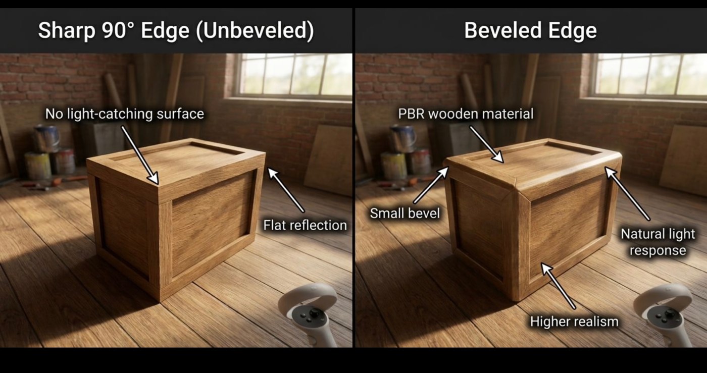
Excessive bloom and volumetric fog are the bane of good visual design.
Exhibit A
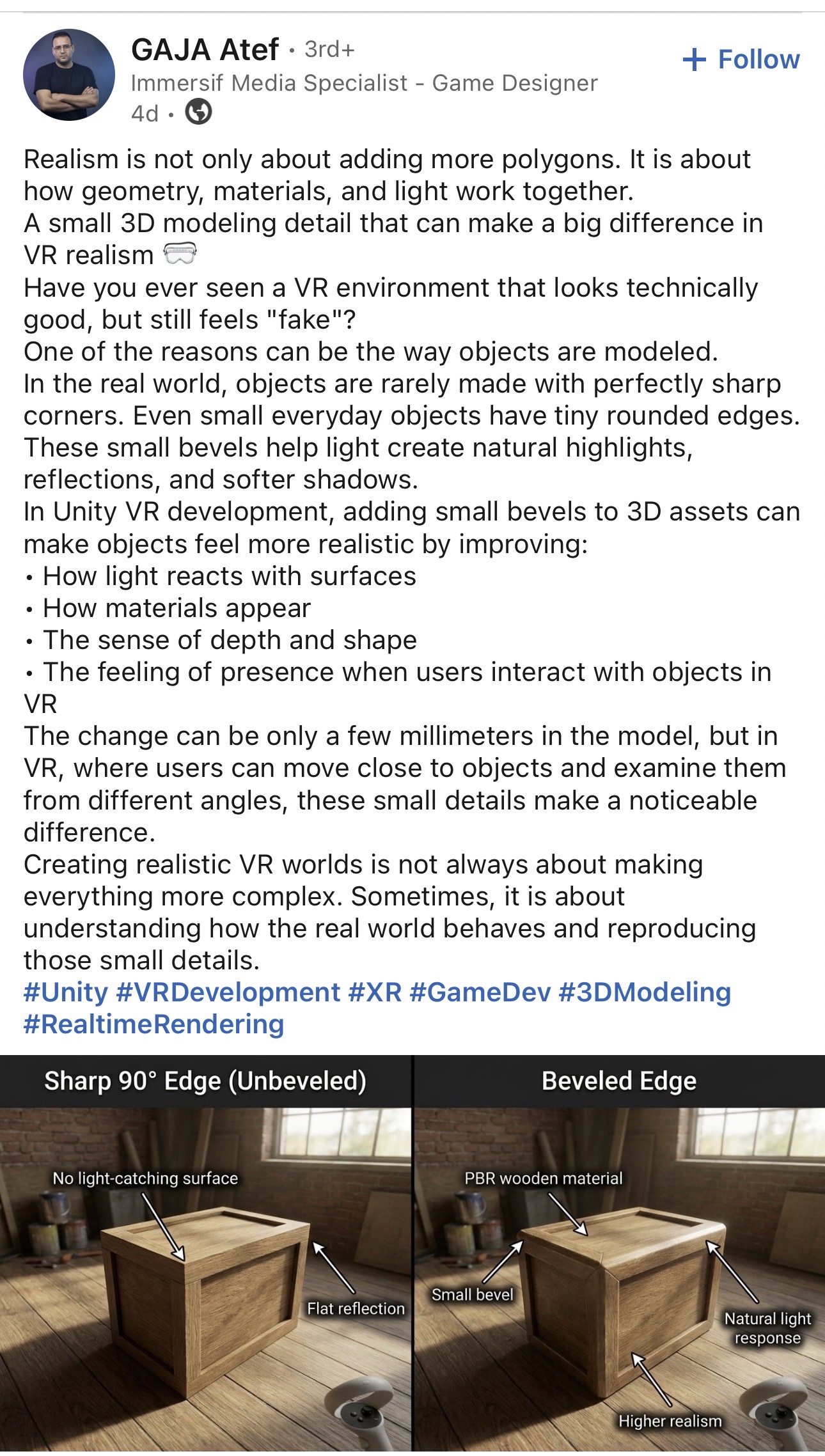
The execution is a crime scene. The bloom just butchers it for me—it’s over-cranked, making the geometry look deformed. Wood is rough but the PBR looks unnaturally smooth. Real wood doesn’t glow like that. Adding smear (bloom) also obliterates contrast. Assuming this is meant to be a utilitarian crate, a massive bevel makes zero sense. If it’s painfully obvious to someone scrolling with a tiny phone screen, the edge is going to look like a melted marshmallow in VR.


Leave a Reply